

Question: Objective: How to do what-if analysis with graphs Required a. Read the article Tweaking the Numbers, by Theo Callahan in the June 2001 issue of
Objective: How to do what-if analysis with graphs Required
a. Read the article “Tweaking the Numbers,” by Theo Callahan in the June 2001 issue of the Journal of Accountancy. (You can find the article online by going to WWW. aicpa. org and following the links to Online Journal of Accountancy.) Follow the instructions in the article to create a spreadsheet with graphs that do what-if analysis.
b. Now create a spreadsheet that does graphical what-if analysis for the “cash gap.” Cash gap represents the number of days between when a company has to pay its suppliers and when it gets paid by its customers. Thus, Cash gap ^ Inventory days on hand + Receivables collection period — Accounts payable period. For exam¬ ple, the cash gap for a company that carries 30 days of inventory, averages 60 days to collect from its customers, and pays its suppliers within 20 days equals 70 days (30 + 60 - 20). The purpose of your spreadsheet is to display graphically what happens to cash gap when you “tweak” policies concerning inventory, receivables, and payables. Thus, you will create a spreadsheet that looks like Figure 14-13. The three spin buttons should have the following values set: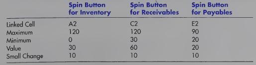
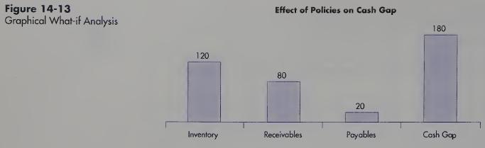
Then create a bar graph that shows the effect of different policies for inventory, receivables, and payables on cash gap. Note; Unlike the tutorial example, you can do this on one page.
Spin Button for Inventory Spin Button Spin Button for Receivables for Payables Linked Cell A2 C2 Maximum 120 120 E2 90 Minimum 0 30 Value 30 60 Small Change 10 10 22220 10
Step by Step Solution
There are 3 Steps involved in it

Get step-by-step solutions from verified subject matter experts