

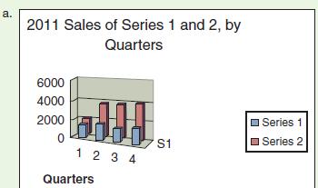
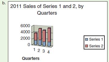
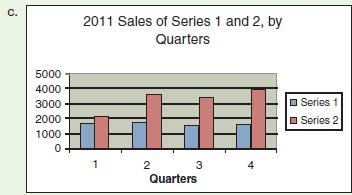
The following three graphs illustrate the sales of two products Series 1 and Series 2
Question:
The following three graphs illustrate the sales of two products — Series 1 and Series 2 — for each quarter of 2011. Which is the most effective in conveying the information? Which is the least effective? What additional information would make the most effective graph better?
Step by Step Answer:

This question has not been answered yet.
You can Ask your question!
Related Book For 

Practical Strategies For Technical Communication
ISBN: 9781457653788
1st Edition
Authors: Mike Markel
Question Posted:
