The following graph shows how immigration (in thousands) to the United States has varied from 1910 to
Question:
The following graph shows how immigration (in thousands) to the United States has varied from 1910 to 2010. The following chart shows how the percentage of eighth graders, tenth graders, and twelfth graders who have used marijuana in their lifetime has varied in recent years.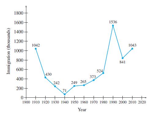
(a) Find the average annual rate of change in immigration from 1910 to 1960.
(b) Find the average annual rate of change in immigration from 1960 to 2010.
(c) Find the average annual rate of change in immigration from 1910 to 2010.
(d) Average your answers to parts (a) and (b), and compare the result with your answer from part (c). Will these always be equal for any two time periods?
(e) If the annual average rate of change for 1960–2010 continues, predict the number of immigrants in 2018. Compare your answer to the actual number of 1,096,611 immigrants.
Step by Step Answer:
Let It represent immigration in thousands in year t a The ...View the full answer