

The graphs show the amount being paid in Social Security benefits and the amount going into the
Question:
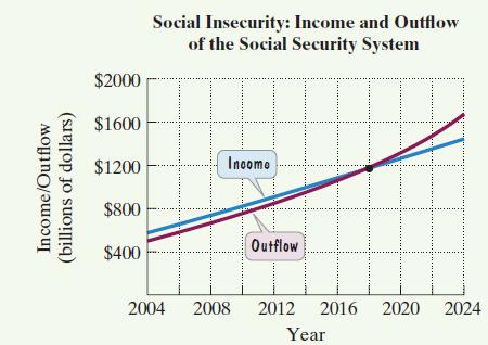
The graphs show the amount being paid in Social Security benefits and the amount going into the system. All data are expressed in billions of dollars. Amounts from 2016 through 2024 are projections.
 Exercises 35–37 are based on the data shown by the graphs. The data for the system’s outflow can be modeled by the formula
![]() where B represents the amount paid in benefits, in billions of dollars, x years after 2004. According to this model, when will the amount paid in benefits be $1177 billion? Round to the nearest year.
where B represents the amount paid in benefits, in billions of dollars, x years after 2004. According to this model, when will the amount paid in benefits be $1177 billion? Round to the nearest year.
Fantastic news! We've Found the answer you've been seeking!
Step by Step Answer:
B007x 474x500 1177 007x 474x500 0 007x ...View the full answer

Answered By
Muhammad Umair
I have done job as Embedded System Engineer for just four months but after it i have decided to open my own lab and to work on projects that i can launch my own product in market. I work on different softwares like Proteus, Mikroc to program Embedded Systems. My basic work is on Embedded Systems. I have skills in Autocad, Proteus, C++, C programming and i love to share these skills to other to enhance my knowledge too.
1+ Reviews
10+ Question Solved
Related Book For 

Question Posted:
