

Question: Volatility at the Pump The graph shows the average price per gallon of gasoline in the United States in January for the period from 2005
Volatility at the Pump The graph shows the average price per gallon of gasoline in the United States in January for the period from 2005 through 2011.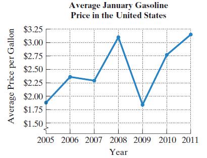 a. For which years was the average price per gallon in January increasing?b. For which years was the average price per gallon in January decreasing?c. How many turning points (from increasing to decreasing or from decreasing to increasing) does the graph have for the period shown?d. Suppose that a polynomial function is used to model the data displayed by the graph using (number of years after 2005, average January price per gallon). Use the number of turning points to determine the degree of the polynomial function of best fit.e. For the model in part (d), should the leading coefficient of the polynomial function be positive or negative? Explain your answer.f. Use the graph to estimate the maximum average January price per gallon. In which year did this occur?g. Use the graph to estimate the minimum average January price per gallon. In which year did this occur?
Gallon per Average Price Average January Gasoline Price in the United States W $3.25 $3.00 $2.75 $2.50 $2.25 $2.00 $1.75 $1.50 2005 2006 2007 2008 2009 2010 2011 Year
Step by Step Solution
3.37 Rating (150 Votes )
There are 3 Steps involved in it
a The average price per gallon in January was increasing fro... View full answer

Get step-by-step solutions from verified subject matter experts