

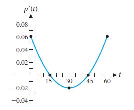
The graph in the figure approximates the rate of change of the price of tomatoes over a
Question:
The graph in the figure approximates the rate of change of the price of tomatoes over a 60-month period, where p(t) is the price of a pound of tomatoes and t is time (in months).
(A) Write a brief description of the graph of y = p(t), including a discussion of local extrema and inflection points.
(B) Sketch a possible graph of y = p(t).
Fantastic news! We've Found the answer you've been seeking!
Step by Step Answer:
A For the first 15 months the price is increasing and concave down with ...View the full answer

Answered By
Ankit Mahajan
I am an electrical engineering graduate from Thapar institute of engineering and technology.
Qualified exams - GATE 2019,2020.
CAT EXAM 2021- 91.4 percentile
SSC EXAMS- 2019,2020,2021
AFCAT EXAM- 2019,2020,2021
I want to share my knowledge with other people so that they can achieve the same.
I have strong hold Mathematics, Electrical engineering and all the subjects related.
Just give me a problem and I will give you the solution of it.
1+ Reviews
10+ Question Solved
Related Book For 

College Mathematics For Business Economics, Life Sciences, And Social Sciences
ISBN: 978-0134674148
14th Edition
Authors: Raymond Barnett, Michael Ziegler, Karl Byleen, Christopher Stocker
Question Posted:
