

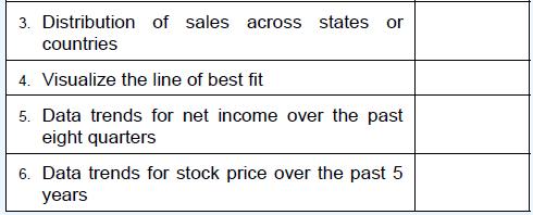
Question: (LO 4-3) Match the desired visualization for quantitative data to the following chart types: Line charts Bar charts Box and whisker plots Scatter plots Filled
(LO 4-3) Match the desired visualization for quantitative data to the following chart types:
Line charts Bar charts Box and whisker plots Scatter plots Filled geographic maps
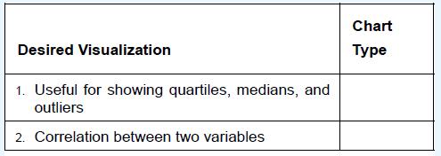
Desired Visualization 1. Useful for showing quartiles, medians, and Chart Type outliers 2. Correlation between two variables
Step by Step Solution
There are 3 Steps involved in it
1 Expert Approved Answer
Step: 1 Unlock

Question Has Been Solved by an Expert!
Get step-by-step solutions from verified subject matter experts
Step: 2 Unlock
Step: 3 Unlock