

Question: Match the desired visualization for quantitative data to the following chart types: Line charts Bar charts Box and whisker plots Scatter plots Filled geographic maps
Match the desired visualization for quantitative data to the following chart types:
- Line charts
- Bar charts
- Box and whisker plots
- Scatter plots
- Filled geographic maps
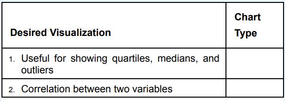
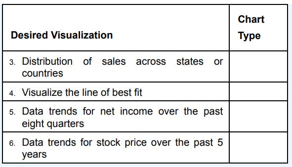
Desired Visualization 1. Useful for showing quartiles, medians, and outliers 2. Correlation between two variables Chart Type
Step by Step Solution
★★★★★
3.46 Rating (159 Votes )
There are 3 Steps involved in it
1 Expert Approved Answer
Step: 1 Unlock

Desired Visualization 1 Useful for showing quartiles medians and outliers 2 Correl... View full answer
Question Has Been Solved by an Expert!
Get step-by-step solutions from verified subject matter experts
Step: 2 Unlock
Step: 3 Unlock