

Question: Consider the pattern shown by the data in the following table (where the values for real GDP are in billions of 2009 dollars): Next, consider
Consider the pattern shown by the data in the following table (where the values for real GDP are in billions of 2009 dollars):
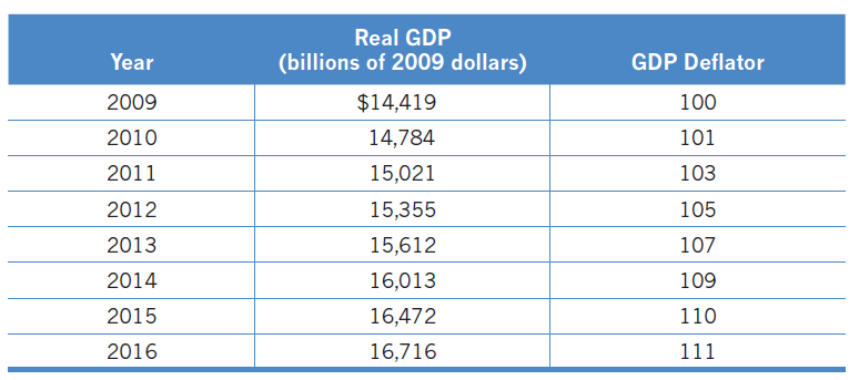
Next, consider Figure 24.1, which has real GDP on the horizontal axis, and the price level, as measured by the GDP deflator, on the vertical axis. On this graph, in which direction did the economy move from 2009 to 2016? Be sure that your answer includes a graph.
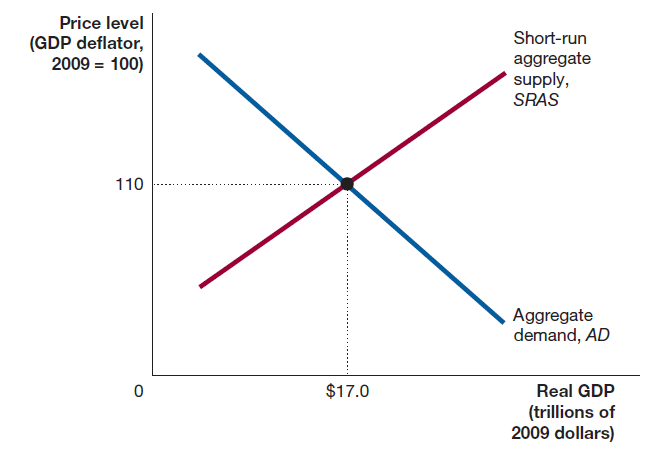
Real GDP Year GDP Deflator (billions of 2009 dollars) 2009 $14,419 100 14,784 2010 101 103 2011 15,021 2012 15,355 105 2013 15,612 107 2014 16,013 109 16,472 2015 110 2016 16,716 111 Price level Short-run (GDP deflator, 2009 = 100) aggregate supply, SRAS 110 Aggregate demand, AD $17.0 Real GDP (trillions of 2009 dollars)
Step by Step Solution
3.41 Rating (185 Votes )
There are 3 Steps involved in it
The economy ... View full answer

Get step-by-step solutions from verified subject matter experts