

Following are the proportions of the United States population that is female for five age groups. a.
Question:
Following are the proportions of the United States population that is female for five age groups.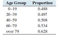
a. Is this a relative frequency table? Explain why or why not?
b. Would it be appropriate to construct a pie chart for these data? Why or why not?
Fantastic news! We've Found the answer you've been seeking!
Step by Step Answer:
SOLUTION a No this is not a relative frequency table For a table to be a relat...View the full answer

Answered By
PALASH JHANWAR
I am a Chartered Accountant with AIR 45 in CA - IPCC. I am a Merit Holder ( B.Com ). The following is my educational details.
PLEASE ACCESS MY RESUME FROM THE FOLLOWING LINK: https://drive.google.com/file/d/1hYR1uch-ff6MRC_cDB07K6VqY9kQ3SFL/view?usp=sharing
3+ Reviews
10+ Question Solved
Related Book For 

Question Posted:
