

Question: For the data in Table 2.23: a. Construct a bar graph in which the y-axis is labeled from 0 to 100. b. Compare this bar
For the data in Table 2.23:
a. Construct a bar graph in which the y-axis is labeled from 0 to 100.
b. Compare this bar graph with the bar graphs in Figures 2.23 and 2.24. Does this bar graph tend to make the difference seem smaller than the other bar graphs do?
c. Which of the three bar graphs do you think presents the most accurate picture of the data? Why?
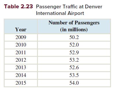
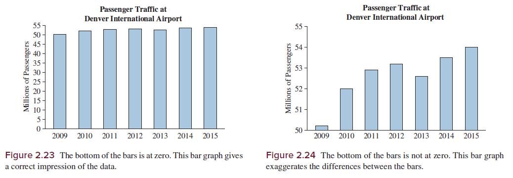
Table 2.23 Passenger Traffic at Denver International Airport Number of Passengers (in millions) 50.2 Year 2009 2010 52.0 2011 52.9 2012 53.2 2013 52.6 2014 53.5 2015 54.0
Step by Step Solution
There are 3 Steps involved in it
1 Expert Approved Answer
Step: 1 Unlock

Question Has Been Solved by an Expert!
Get step-by-step solutions from verified subject matter experts
Step: 2 Unlock
Step: 3 Unlock