

Question: 2. (LO 6.4) The following scatterplot shows the relationship between average high monthly temperature (in Fahrenheit) and ice cream sales for a small ice cream
2. (LO 6.4) The following scatterplot shows the relationship between average high monthly temperature (in Fahrenheit) and ice cream sales for a small ice cream stand. The correlation coefficient is 0.87.
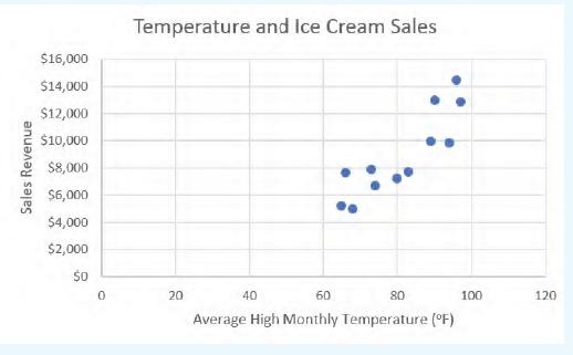
a. Interpret the correlation value. Is the correlation strong?
b. Using the scatterplot, determine if the two variables are positively correlated or negatively correlated.
c. Suppose we want to run a linear regression model/equation for the data. What is the independent variable? What is the dependent (outcome) variable?
Sales Revenue $16,000 $14,000 $12,000 $10,000 $8,000 $6,000 $4,000 $2,000 $0 Temperature and Ice Cream Sales 0 20 40 60 80 Average High Monthly Temperature (F) 100 120
Step by Step Solution
There are 3 Steps involved in it

Get step-by-step solutions from verified subject matter experts