

Question: Data from the U.S Census Bureau was used to construct the accompanying pie chart that reflects changes of residence between 1995 and 2000. Construct a
Data from the U.S Census Bureau was used to construct the accompanying pie chart that reflects changes of residence between 1995 and 2000. Construct a bar graph for these data. Which graph is a more effective display of the data? Explain.
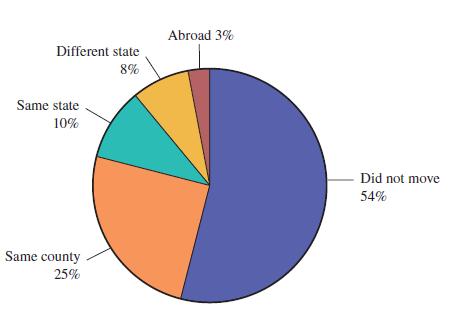
Different state 8% Same state 10% Same county 25% Abroad 3% Did not move 54%
Step by Step Solution
★★★★★
3.45 Rating (155 Votes )
There are 3 Steps involved in it
1 Expert Approved Answer
Step: 1 Unlock

In this case the bar chart is more effective compared to a pie cha... View full answer
Question Has Been Solved by an Expert!
Get step-by-step solutions from verified subject matter experts
Step: 2 Unlock
Step: 3 Unlock