

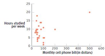
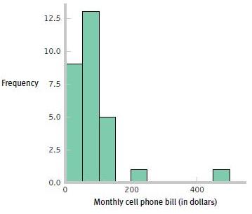
Question: The following figures display data that depict the relation between students' monthly cell phone bills and the number of hours they report that they study
The following figures display data that depict the relation between students' monthly cell phone bills and the number of hours they report that they study per week.
a. What does the accompanying scatterplot suggest about the shape of the distribution for hours studied per week? What does it suggest about the shape of the distribution for a monthly cell phone bill?
b. What does the accompanying grouped frequency histogram suggest about the shape of the distribution for a monthly cell phone bill?
c. Is it a good idea to use a parametric hypothesis test for these data? Explain.
25 20 15 Hours studied per week 10 100 200 300 400 500 600 Monthly cell phone bill (in dollars)
Step by Step Solution
3.32 Rating (170 Votes )
There are 3 Steps involved in it
a Hours studied per week appears to be roughly normal with observations ac... View full answer

Get step-by-step solutions from verified subject matter experts
Document Format (2 attachments)
1421_60547789d93df_662975.pdf
180 KBs PDF File
1421_60547789d93df_662975.docx
120 KBs Word File