

Question: In Exercise 5 you were asked whether you thought the differences in political identification across diet preferences were real. To examine that question further, we
In Exercise 5 you were asked whether you thought the differences in political identification across diet preferences were real. To examine that question further, we randomly scrambled the students’ politics preferences and created 8 new bar charts of these scrambled distributions (see below).
a) Can you spot the original data among the 8 new charts?
b) How does this support your answer to Exercise 5b?
Data From Exercise 5
The survey of 299 undergraduate students from Exercise 86 in Chapter 2 (data in Student Survey) asked about respondents’ diet preference (Carnivore, Omnivore, Vegetarian) and political alignment (Liberal, Moderate, Conservative). Here is a stacked bar chart of the 285 responses:
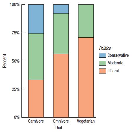
Percent 100% 75% 50% 25% 0% Carnivore Omnivore Diet Vegetarian Politics Conservative Moderate Liberal
Step by Step Solution
3.50 Rating (163 Votes )
There are 3 Steps involved in it
a The upper right bar chart shows the original data b Its ... View full answer

Get step-by-step solutions from verified subject matter experts