

Question: The scatterplot shows the median weekly earning (by quarter) for men and women in the United States for the years from 2005 through 2017. The
The scatterplot shows the median weekly earning (by quarter) for men and women in the United States for the years from 2005 through 2017. The correlation is 0.974.
a. Use the scatterplot to estimate the median weekly income for women in a quarter in which the median pay for men is about $850.
b. Use the regression equation shown above the graph to get a more precise estimate of the median pay for women in a quarter in which the median pay for men is $850.
c. What is the slope of the regression equation? Interpret the slope of the regression equation.
d. What is the y-intercept of the regression equation? Interpret the y-intercept of the regression equation or explain why it would be inappropriate to do so.
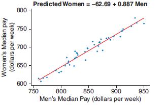
Predicted Women = -62.69 + 0.887 Men 800 - 750 700 650 600 900 850 Men's Median Pay (dollars per week) 750 800 950 Women's Median pay (dollars per week)
Step by Step Solution
3.40 Rating (153 Votes )
There are 3 Steps involved in it
1 According to a scatterplot the anticipated median salary for women is 740 2 According to t... View full answer

Get step-by-step solutions from verified subject matter experts