

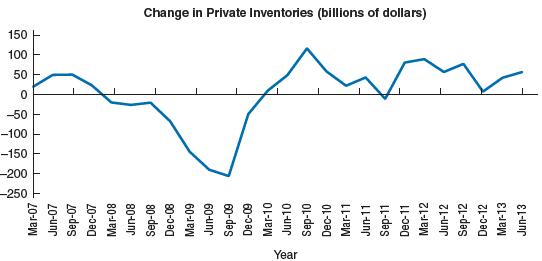
The following graph shows the quarterly change in private inventories in the United States from 2007 to
Question:
The following graph shows the quarterly change in private inventories in the United States from 2007 to 2010. (Figures are billions of 2005 dollars.) Explain the changes in private inventories during this period.
Fantastic news! We've Found the answer you've been seeking!
Step by Step Answer:
Certainly Lets analyze the changes in private inventories in the United States during the period fro...View the full answer

Answered By
PALASH JHANWAR
I am a Chartered Accountant with AIR 45 in CA - IPCC. I am a Merit Holder ( B.Com ). The following is my educational details.
PLEASE ACCESS MY RESUME FROM THE FOLLOWING LINK: https://drive.google.com/file/d/1hYR1uch-ff6MRC_cDB07K6VqY9kQ3SFL/view?usp=sharing
3+ Reviews
10+ Question Solved
Related Book For 

Question Posted:
