

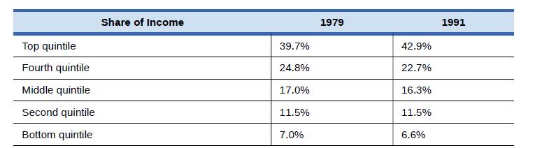
Table 15.9 shows the share of income going to each quintile of the income distribution for the
Question:
Table 15.9 shows the share of income going to each quintile of the income distribution for the United Kingdom in 1979 and 1991. Use this data to calculate what the points on a Lorenz curve would be, and sketch the Lorenz curve. How did inequality in the United Kingdom shift over this time period? How can you see the patterns in the quintiles in the Lorenz curves?
Table 15.9
Fantastic news! We've Found the answer you've been seeking!
Step by Step Answer:
Just from glancing at the quintile information it is fairly obvious that income inequality increased ...View the full answer

Answered By
Nicholas Maina
Throughout my tutoring journey, I've amassed a wealth of hands-on experience and honed a diverse set of skills that enable me to guide students towards mastering complex subjects. My proficiency as a tutor rests on several key pillars:
1. Subject Mastery:
With a comprehensive understanding of a wide range of subjects spanning mathematics, science, humanities, and more, I can adeptly explain intricate concepts and break them down into digestible chunks. My proficiency extends to offering real-world applications, ensuring students grasp the practical relevance of their studies.
2. Individualized Guidance:
Recognizing that every student learns differently, I tailor my approach to accommodate various learning styles and paces. Through personalized interactions, I identify a student's strengths and areas for improvement, allowing me to craft targeted lessons that foster a deeper understanding of the material.
3. Problem-Solving Facilitation:
I excel in guiding students through problem-solving processes and encouraging critical thinking and analytical skills. By walking learners through step-by-step solutions and addressing their questions in a coherent manner, I empower them to approach challenges with confidence.
4. Effective Communication:
My tutoring proficiency is founded on clear and concise communication. I have the ability to convey complex ideas in an accessible manner, fostering a strong student-tutor rapport that encourages open dialogue and fruitful discussions.
5. Adaptability and Patience:
Tutoring is a dynamic process, and I have cultivated adaptability and patience to cater to evolving learning needs. I remain patient through difficulties, adjusting my teaching methods as necessary to ensure that students overcome obstacles and achieve their goals.
6. Interactive Learning:
Interactive learning lies at the heart of my approach. By engaging students in discussions, brainstorming sessions, and interactive exercises, I foster a stimulating learning environment that encourages active participation and long-term retention.
7. Continuous Improvement:
My dedication to being an effective tutor is a journey of continuous improvement. I regularly seek feedback and stay updated on educational methodologies, integrating new insights to refine my tutoring techniques and provide an even more enriching learning experience.
In essence, my hands-on experience as a tutor equips me with the tools to facilitate comprehensive understanding, critical thinking, and academic success. I am committed to helping students realize their full potential and fostering a passion for lifelong learning.
5+ Reviews
16+ Question Solved
Related Book For 
Question Posted:
