

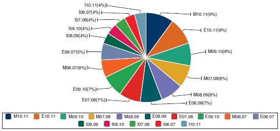
Technology has made data visualization accessible to everyone. Indeed, this is a good thing. Yet it is
Question:
Technology has made data visualization accessible to everyone. Indeed, this is a good thing. Yet it is up to the user to properly use visualization tools. Below is a pie chart built a few years back, using an open portal platform. The intention was to summarize school performance data. Specifically, the data included two variables:
• One indicating school subject and school year (e.g. M10-11 for Math in the 2010–2011 academic year).
• The second, establishing the target: minimum percentage of students that pass standardized tests.
These two variables were used to create the chart. Mention at least three things that are wrong with this chart.
Fantastic news! We've Found the answer you've been seeking!
Step by Step Answer:

Answered By
Pushpinder Singh
Currently, I am PhD scholar with Indian Statistical problem, working in applied statistics and real life data problems. I have done several projects in Statistics especially Time Series data analysis, Regression Techniques.
I am Master in Statistics from Indian Institute of Technology, Kanpur.
I have been teaching students for various University entrance exams and passing grades in Graduation and Post-Graduation.I have expertise in solving problems in Statistics for more than 2 years now.I am a subject expert in Statistics with Assignmentpedia.com.
3+ Reviews
10+ Question Solved
Related Book For 
Principles Of Managerial Statistics And Data Science
ISBN: 9781119486411
1st Edition
Authors: Roberto Rivera
Question Posted:
