

When constructing histograms, the statistical software being used will commonly determine how the graph looks. In Example
Question:
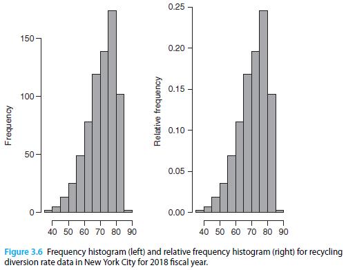
When constructing histograms, the statistical software being used will commonly determine how the graph looks. In Example 3.2, histograms were developed to summarize diversion rates in New York City (Figure 3.6). The required steps and output to get a histogram summarizing the same data using Minitab can be found in Figure 3.24. Why does the resulting histogram have a different shape than the ones seen in Figure 3.6?
Example 3.2
Figure 3.6 presents a histogram of 2018 recycling diversion rates (total recycling / total waste × 100) for several New York City zones8 in terms of frequencies (left) and relative frequencies (right).
Step by Step Answer:

This question has not been answered yet.
You can Ask your question!
Related Book For 
Principles Of Managerial Statistics And Data Science
ISBN: 9781119486411
1st Edition
Authors: Roberto Rivera
Question Posted:
