

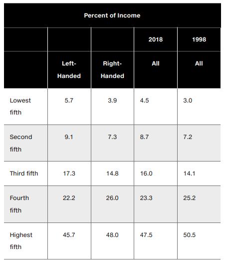
By using the data in the following table, create two graphs. The first graph should plot the
Question:
By using the data in the following table, create two graphs. The first graph should plot the Lorenz curves for left-handed people and right-handed people. The second graph should plot the Lorenz curve for the 1998 “all” data and the Lorenz curve for the 2018 “all” data.In each graph, which has the higher Gini coefficient? How do you interpret the result?
Step by Step Answer:

This question has not been answered yet.
You can Ask your question!
Related Book For 

Mylab Economics With Pearson Access Code For Principles Of Microeconomics
ISBN: 9780135197141,9780135197103
13th Edition
Authors: Karl E. Case; Ray C. Fair; Sharon E. Oster
Question Posted:
