

Question: PERFORMANCE GRAPH The following performance graph compares the cumulative five-year total return to shareholders on our common stock relative to the cumulative total returns of
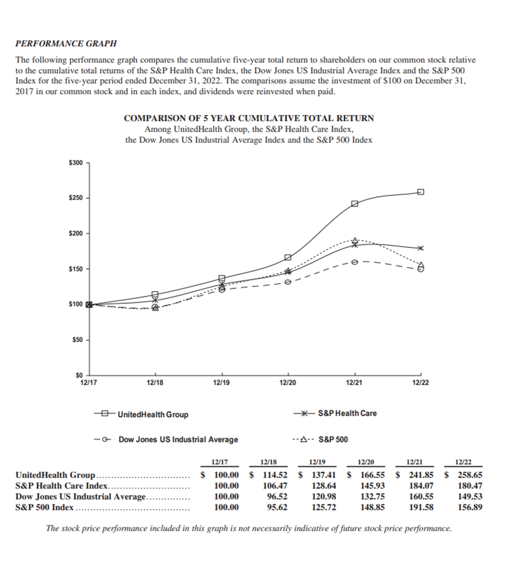
PERFORMANCE GRAPH The following performance graph compares the cumulative five-year total return to shareholders on our common stock relative to the cumulative total returns of the S&P Health Care Index, the Dow Jones US Industrial Average Index and the S&P 500 Index for the five-year period ended December 31, 2022. The comparisons assume the investment of $100 on December 31, 2017 in our common stock and in each index, and dividends were reinvested when paid. COMPARISON OF 5 YEAR CUMULATIVE TOTAL RETURN Among UnitedHealth Group, the S&P Health Care Index, the Dow Jones US Industrial Average Index and the S&P 500 Index $300 7 $250 - $200 $150 - e $100 $50 - SO - 12/17 12/18 12/19 12/20 12/21 12/22 O- UnitedHealth Group -* S&P Health Care -G- Dow Jones US Industrial Average - -A- - S&P 500 12/17 12/18 12/19 12/20 12/21 12/22 UnitedHealth Group ........ $ 100.00 $ 114.52 $ 137.41 $ 166.55 $ 241.85 $ 258.65 S&P Health Care Index...... 100.00 106.47 128.64 145.93 184.07 180.47 Dow Jones US Industrial Average... 100.00 96.52 120.98 132.75 160.55 149.53 S&P 500 Index ..... 100.00 95.62 125.72 148.85 191.58 156.89 The stock price performance included in this graph is not necessarily indicative of future stock price performance
Step by Step Solution
There are 3 Steps involved in it

Get step-by-step solutions from verified subject matter experts