Question: 1. Introduction In this experiment, students will understand how to construct X-bar and R charts in Excel. 2. Objectives Draw X-bar and R charts in
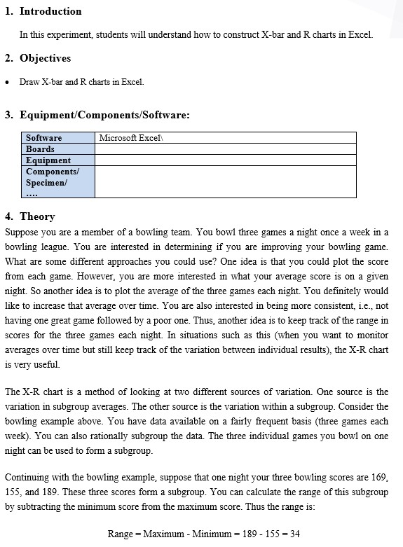
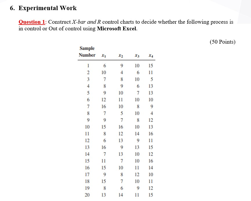
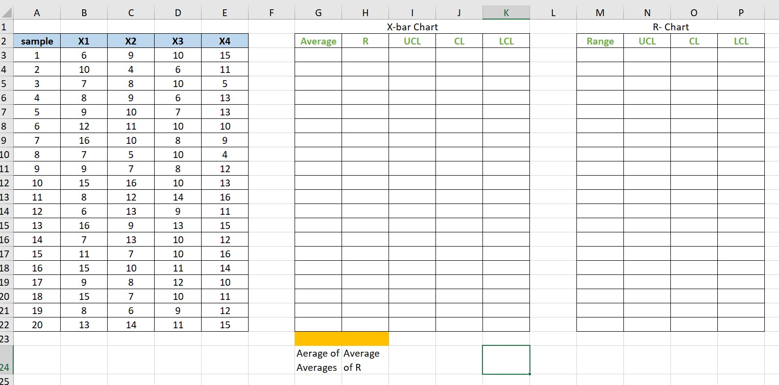
1. Introduction In this experiment, students will understand how to construct X-bar and R charts in Excel. 2. Objectives Draw X-bar and R charts in Excel. . 3. Equipment/Components/Software: Microsoft Excel Software Boards Equipment Components/ Specimen 4. Theory Suppose you are a member of a bowling team. You bowl three games a night once a week in a bowling league. You are interested in determining if you are improving your bowling game. What are some different approaches you could use? One idea is that you could plot the score from each game. However, you are more interested in what your average score is on a given night. So another idea is to plot the average of the three games each night. You definitely would like to increase that average over time. You are also interested in being more consistent, i.e. not having one great game followed by a poor one. Thus, another idea is to keep track of the range in scores for the three games each night. In situations such as this (when you want to monitor averages over time but still keep track of the variation between individual results), the X-R chart is very useful. The X-R chart is a method of looking at two different sources of variation. One source is the variation in subgroup averages. The other source is the variation within a subgroup. Consider the bowling example above. You have data available on a fairly frequent basis (three games each week). You can also rationally subgroup the data. The three individual games you bowl on one night can be used to form a subgroup. Continuing with the bowling example, suppose that one night your three bowling scores are 169, 155, and 189. These three scores form a subgroup. You can calculate the range of this subgroup by subtracting the minimum score from the maximum score. Thus the range is: Range = Maximum - Minimum 189 - 155 = 34 You can plot this value on a range (R) chart. This is done for each subgroup one night of bowling three games). The range chart shows how much variation there is within each subgroup, i.e., the amount of variation in your bowling scores on one night. You would like this variation to be small and be consistent over time. The chart for averages (X) presents a different variation than the range chart. Using the three scores above, you can calculate an average score for the night by taking the average of the three individual scores. The subgroup average is: X = (169+155+189)/3 = 171 You can plot this value on the X chart. This is done for each subgroup. The X chart shows how much week to week variation there is in your weekly average bowling score. You would like this variation to be small and be consistent over time. This permits you to predict what your average score will be on any night, within certain limits. The figure below is an example of the X-R chart for this bowling example. The top part of the figure is the X chart. Each weekly average bowling score (i.e., the average of the three individual games) is plotted. The overall average (Xdbar = X double bar) has been calculated and plotted as a solid line. Xdbar is the average of all the subgroup averages. Upper and lower control limits have also been calculated and plotted. The X chart is in statistical control. The lower part of the figure is the range (R) chart. The range is plotted for each week. The average range and control limits have been calculated and plotted. The range is also in statistical control. LCL-157.9, -14.3, for subgroups 1-20) 220 210 CE Average 200 190 180 170 What does it mean when the X-R chart is in statistical control? It means that the subgroup average is consistent over time and the Xbar Chart Bowling Scores (Avg=182.7, UCL-207.5. variation within a subgroup is consistent over time. We can predict what the process will do in the near future. In the bowling example, this means that you can predict what the average of your three games on any given night will be. Your average will 2 3 4 5 6 7 8 9 10 11 12 13 14 15 16 17 18 19 20 be between 140 and 181with a long term average of about 161. You can also predict what your range in Range (Aug-24.3, UCL-62.4, LCL-None) bowling scores will be on any given night. The range can be anywhere from 0 to 52 with an average range of 160 150 Week Number UCL 70 60 50 40 30 20 10 0 AO 9 10 11 12 13 14 15 16 17 18 19 20 Week Number about 20. As long as the process stays in control (your bowling), the results will continue to the same. How to draw X-bar chart using Excel: 1- Find the average equation for each row using the below equation; =Average(" highlight cells from B3 to E3") Then drag for all cells 2- Find the R equation for each row using the below equation: =Max(" highlight cells from B3 to E3%)-Min("highlight cells from B3 to E3") Then drag for all cells 3- Find the Average of all Averages using the below equation: = Average("highlight all average column") 4- Find the Average of all R values using the below equation: = Average("highlight all R column") 5- Find the upper control limit number using the below equation: = Average of all averages+A2* Average of R column 6- Find the CL which is average of all averages 7- Find lower control limit using the below equation 8- = Average of all averages-Az*Average of R column 9- To draw the chart, highlight the UCL, CL, LCL and Average columns one by one then go to InserRecommended chartschoose the first on the left How to draw R chart using Excel: 1- Find the UCL using the below equation: =D4* average of R 2- Find the CL which is average of R 3- Find the LCL using the below equation: =D;* average of R 4- To draw the chart, highlight the UCL, CL, LCL and R columns one by one then go to Inser>Recommended chartschoose the first on the left 5. Pre-lab Preparation Review Variables Control Charts lecture before coming to the lab. 6. Experimental Work Question 1: Construct X-bar and R control charts to decide whether the following process is in control or Out of control using Microsoft Excel. (50 Points) Sample Number X1 X3 X4 9 4 8 9 10 16 2 10 3 7 4 8 5 9 6 12 7 16 8 7 9 9 10 15 11 8 12 6 13 16 14 7 15 11 16 15 17 9 18 15 19 8 20 13 10 6 10 6 7 10 8 10 8 10 14 9 13 10 10 11 12 10 9 11 15 11 5 13 13 10 9 4 12 13 16 10 5 7 16 12 13 9 13 7 15 12 16 14 10 10 8 7 6 14 12 15 A B C D E F G H J L M o P 1 I X-bar Chart UCL N R- Chart UCL CL 2 X1 X3 X4 Average R CL LCL Range sample 1 LCL X2 9 6 3 4 10 6 15 11 2 10 4 5 3 7 8 10 5 6 4 8 9 6 13 [ 5 9 10 7 13 7 8 9 6 11 10 10 12 16 7 10 8 9 10 5 4 8 9 7 9 11 7 12 900 93 12 10 15 16 13 11 8 12 16 13 14 15 12 6 13 9 11 13 16 9 13 15 16 14 7 13 10 12 17 15 11 7 10 16 18 16 15 11 14 19 17 9 900 N 12 10 20 15 10 11 18 19 21 6 9 12 22 20 13 14 11 15 23 Aerage of Average Averages of R 224 25


