

Question: 1. Provide an appropriate graphical display to visualise average number of hours of work per week over time (i.e., for the years 2003-2012). Comment on

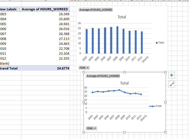
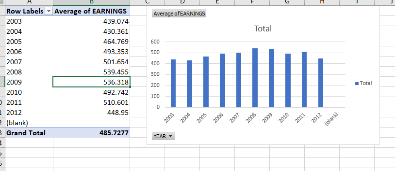
1. Provide an appropriate graphical display to visualise average number of hours of work per week over time (i.e., for the years 2003-2012). Comment on the trend you observe in your graphical display, and provide an explanation for why this may make sense. (Note that you will need to calculate averages for each year.) 2. Now provide a graphical display that additionally shows the average weekly earnings over time (i.e., for the years 2003-2012). What appears to be the relationship between average weekly earnings and average number of hours worked per week? Also provide an appropriate statistical measure of the association between weekly earnings and number of hours worked per week (for the original data, not the yearly averages), and comment on what this suggests about the relationship between weekly earnings and weekly number of hours worked.low Labels * Average of HOURS_WORKED Average of HOURS_WORKED 003 24.349 004 25.609 Total 005 24.941 30 1006 26.016 25 007 26.368 20 008 27.113 15 009 24.463 10 Total 010 22.708 5 1011 23.104 012 22.103 2003 2004 2005 2007 2008 2009 2010 2011 2012 blank blank) Grand Total 24.6774 YEAR - Average of HOURS_WORKED Total 30 25 20 15 1o Total 2003 2004 2005 2006 012 20 200 2009 2010 2011 (blank) YEARC Row Labels * Average of EARNINGS Average of EARNINGS 2003 439.074 2004 430.361 Total 2005 464.769 600 2006 493.353 500 2007 501.654 400 2008 539.455 300 2009 536.318 200 Total 2010 492.742 100 2011 510.601 0 2012 448.95 03 20 2004 (blank) 2005 06 20 200 200 2009 2010 2011 2012 (blank) Grand Total 485.7277 YEAR
Step by Step Solution
There are 3 Steps involved in it

Get step-by-step solutions from verified subject matter experts