

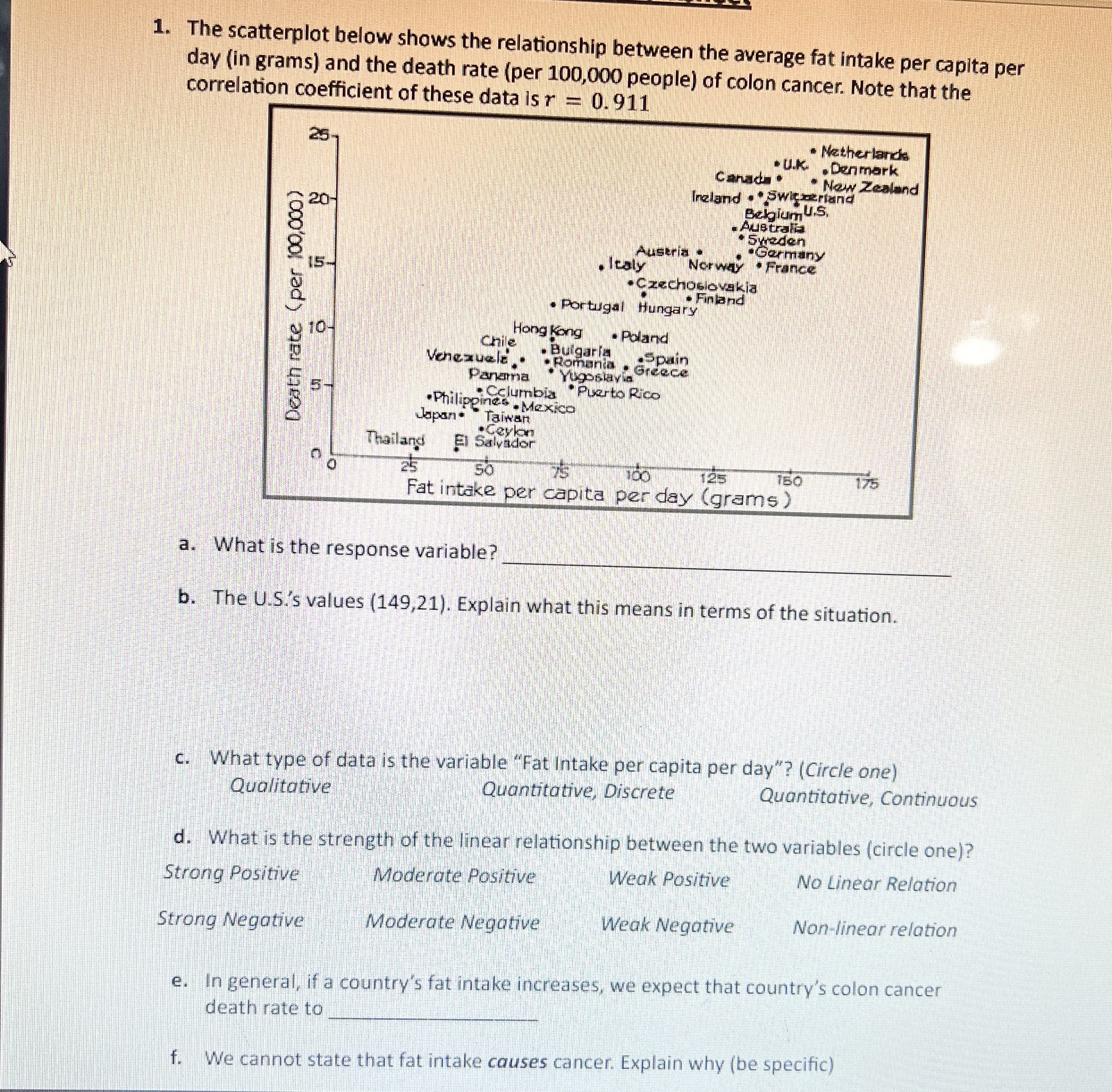
Question: 1. The scatterplot below shows the relationship between the average fat intake per capita per day (in grams) and the death rate (per 100,000 people)
Step by Step Solution
There are 3 Steps involved in it

Get step-by-step solutions from verified subject matter experts