

Question: 1. What does the curved line represent in the graph?2. According to the table, what percentage of total income does the highest fifth of the
1. What does the curved line represent in the graph?2. According to the table, what percentage of total income does the highest fifth of the population3. According to the table, what percentage of total income does the lowest quintile of thepopulation have?4. What does the straight line on the graph above represent?5. Analyzing Information Ex plain the relationship between consumer expectations and economicperformance.6. Checking Consistency Ex plain how a person can be employed and still be living under thepoverty threshold.
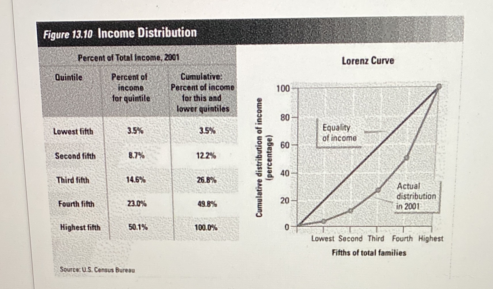
Figure 13.10 Income Distribution Percent of Total Income, 2001 Lorenz Curve Quintile Percent of Cumulative. income Percent of income 100 for quintile for this and lower quintiles 80 Lowest fifth 3.5% 3.5% Equality of income 60 Second fifth 8.7% 12.2% (percentage) Cumulative distribution of income 40 Third fifth 14.6% 26.8% Actual distribution 20 Fourth fifth 23.0% 49.8% in 2001 Highest fifth 50.1% 100.0% 0 Lowest Second Third Fourth Highest Fifths of total families Source: U.S. Census Bureau
Step by Step Solution
There are 3 Steps involved in it

Get step-by-step solutions from verified subject matter experts