

Question: 1 . X - axis: Label the X - axis with numbers and the independent variable name including units. Try to use most of the
Xaxis: Label the Xaxis with numbers and the independent variable name including units. Try to use most of the figure ie spread out your numbers so they go most of the way across
Yaxis: Label the Yaxis with numbers and the dependent variable name including units. Try to use most of the figure ie spread out your numbers so they go most of the way up
Do a scatter plot of your data from table A scatter plot will show if your two data points at each light level are close together or far apart.
Sketch a best fit line between the data points, being sure the reader can still see every data point.
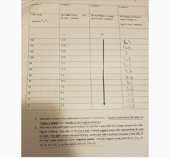
Calculate column by subtraction Column Column Column represents DO when no Elodea is added ie the DO of the original solution
Plot the X axis with Light Level column and the Y axis with DO change column in the Figure below. Two tips: For the X axis, I would suggest every line representing units The light values are quantitative, so be sure is halfway between and For the Y axis, there are some negative values. I would suggest using units of ieldots so the values will run to
Step by Step Solution
There are 3 Steps involved in it
1 Expert Approved Answer
Step: 1 Unlock

Question Has Been Solved by an Expert!
Get step-by-step solutions from verified subject matter experts
Step: 2 Unlock
Step: 3 Unlock