

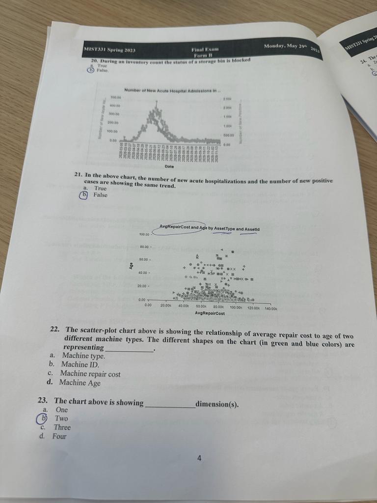
Question: 2 2 . The scatter - plot chart above is showing the relationship of average repair cost to age of two different machine types. The
The scatterplot chart above is showing the relationship of average repair cost to age of two different machine types. The different shapes on the chart in green and blue colors are representing
a Machine type.
b Machine ID
c Machine repair cost
d Machine Age
Step by Step Solution
There are 3 Steps involved in it
1 Expert Approved Answer
Step: 1 Unlock

Question Has Been Solved by an Expert!
Get step-by-step solutions from verified subject matter experts
Step: 2 Unlock
Step: 3 Unlock