

Question: 2. Using the information in figure 8-1 on page 107, construct a graph in Google Sheets. You may type data into the Google Sheets file
2. Using the information in figure 8-1 on page 107, construct a graph in Google Sheets. You may type data into the Google Sheets file cells. I have provided examples on both sheets for you. **Place the four time periods along the horizontal axis and the percentage of immigrants on the vertical axis.
3. Describe the pattern for each of the eight regions/countries in the graph. Could you offer a reason for any
change in the pattern?
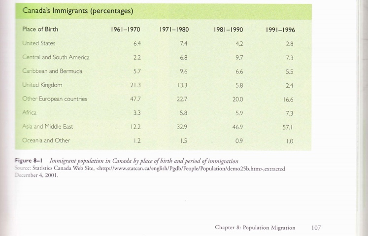
Canada's Immigrants (percentages) Place of Birth 1961-1970 1971-1980 1981-1990 1991-1996 United States 6.4 7.4 4.2 2.8 Central and South America 2.2 6.8 9.7 7.3 Caribbean and Bermuda 5.7 9.6 6.6 5.5 United Kingdom 21.3 13.3 5.8 2.4 Other European countries 47.7 22.7 20.0 16.6 Africa 3.3 5.8 5.9 7.3 Asia and Middle East 12.2 32.9 46.9 57.1 Oceania and Other 1.2 1.5 0.9 1.0 Figure 8-1 Immigrant population in Canada by place of birth and period of immigration Source: Statistics Canada Web Site,
Step by Step Solution
There are 3 Steps involved in it

Get step-by-step solutions from verified subject matter experts