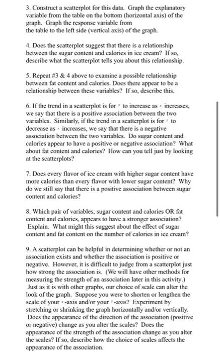
Question: 3. Construct a scatterplot for this data. Graph the explanatory variable from the table on the bottom (horizontal axis) of the graph. Graph the response
3. Construct a scatterplot for this data. Graph
3. Construct a scatterplot for this data. Graph the explanatory variable from the table on the bottom (horizontal axis) of the graph. Graph the response variable from the table to the left side (vertical axis) of the graph. 4. Does the scatterplot suggest that there is a relationship between the sugar content and calories in ice cream? If so, describe what the scatterplot tells you about this relationship. 5. Repeat #3 & 4 above to examine a possible relationship between fat content and calories. Does there appear to be a relationship between these variables? If so, describe this. 6. If the trend in a scatterplot is for to increase as increases, we say that there is a positive association between the two variables. Similarly, if the trend in a scatterplot is for to decrease as increases, we say that there is a negative association between the two variables. Do sugar content and calories appear to have a positive or negative association? What about fat content and calories? How can you tell just by looking at the scatterplots? 7. Does every flavor of ice cream with higher sugar content have more calories than every flavor with lower sugar content? Why do we still say that there is a positive association between sugar content and calories? 8. Which pair of variables, sugar content and calories OR fat content and calories, appears to have a stronger association? Explain. What might this suggest about the effect of sugar content and fat content on the number of calories in ice cream? 9. A scatterplot can be helpful in determining whether or not an association exists and whether the association is positive or negative. However, it is difficult to judge from a scatterplot just how strong the association is. (We will have other methods for measuring the strength of an association later in this activity.) Just as it is with other graphs, our choice of scale can alter the look of the graph. Suppose you were to shorten or lengthen the scale of your +-axis and/or your -axis? Experiment by stretching or shrinking the graph horizontally and/or vertically. Does the appearance of the direction of the association (positive or negative) change as you alter the scales? Does the appearance of the strength of the association change as you alter the scales? If so, describe how the choice of scales affects the appearance of the association

Step by Step Solution

There are 3 Steps involved in it

1 Expert Approved Answer
Step: 1 Unlock blur-text-image
Question Has Been Solved by an Expert!

Get step-by-step solutions from verified subject matter experts

Step: 2 Unlock
Step: 3 Unlock

Students Have Also Explored These Related General Management Questions!