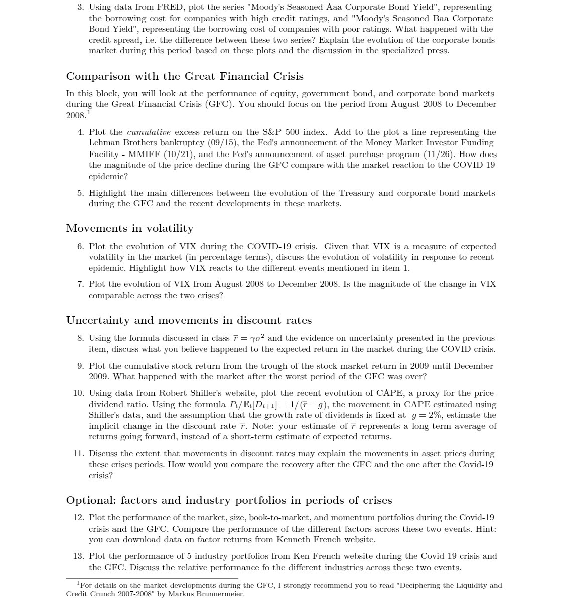
Question: 3. Using data from FRED, plot the series Moody's Seasoned Aaa. Corporate Bond Yield, representing the borrowing cost for companies with high credit ratings, and
3. Using data from FRED, plot the series "Moody's Seasoned Aaa. Corporate Bond Yield", representing the borrowing cost for companies with high credit ratings, and "Moody's Seasoned Baa Corporate Bond Yiel ", representing the borrowing cost of companies with poor ratings. What happened with the credit spread, i.e. the difference between these two series? Explain the evolution of the corporate bonds market during this period based on these plots and the discussion in the specialized press. Comparison with the Great Financial Crisis In this block, you will look at the performance of equity, government bond, and corporate bond markets during the Great Financial Crisis [CFC]. You should focus on the period from August 2008 to December 2003.' 4. Plot the cumulative excess return on the SEEP 500 index. Add to the plot a line representing the Lehman Brothers bankruptcy (00/15), the Fed's announcement of the Money Market Investor Funding Facility MMIFF (10/21), and the Fed's announcement of asset purchase program (11 f 26]. How does the magnitude of the price decline during the CFO compare with the market reaction to the COVIDlQ epidemic? 5. Highlight the main differences between the evolution of the Treasury and corporate bond markets during the CFO and the recent developments in these markets. Movements in volatility 6. Plot the evolution of VIX during the COVIDIQ crisis. Given that VIX is a measure of expected volatility in the market {in percentage terms), discuss the evolution of volatility in response to recent epidemic. Highlight how VIX reacts to the different events mentioned in item 1. 7. Plot the evolution of VIX from August 2008 to December 2008. Is the magnitude of the change in VIX comparable across the two crises? Uncertainty and movements in discount rates 8. Using the formula dismissed in class F = 1/02 and the evidence on uncertainty presented in the previous item, discuss what you believe happened to the expected return in the market during the COVID crisis. 9. Plot the cumulative stock return from the trough of the stock market return in 2009 until December 2009. What happened with the market after the worst period of the CFC was over? 10. Using data from Robert Shiller's website, plot the recent evolution of CAPE, a proxy for the price dividend ratio. Using the formula Pt/lEtlDi+1] = 1/ G g), the movement in CAPE estimated using Shiller's data, and the assumption that the growth rate of dividends is xed at g = 2%, estimate the implicit change in the discount rate R Note: your estimate of F represents a longterm average of returns going forward, instead of a shortterm estimate of expected returns. 11. Discuss the extent that movements in discount rates may explain the movements in asset prices during these crises periods. How would you compare the recovery after the CFO and the one after the CovidlQ crisis? Optional: factors and industry portfolios in periods of crises 12. Plot the performance of the market, size, booktomarket, and momentum portfolios during the CovidIQ crisis and the CFC. Compare the performance of the different factors across these two events. Hint: you can download data on factor returns from Kenneth French website. 13. Plot the performance of 5 industry portfolios from Ken French website during the CovidlQ crisis and the GFC. Discuss the relative performance fo the different industries across these two events. 1For details on the market developments during the GFC, I strongly recommend you to read "Deciphering the Liquidity and Credit Crunch 20072008" by Markus Brunnermeier


