

Question: 30. Salaries Use a scatter plot to display the data shown in the table at the left. The data represent the numbers of students per
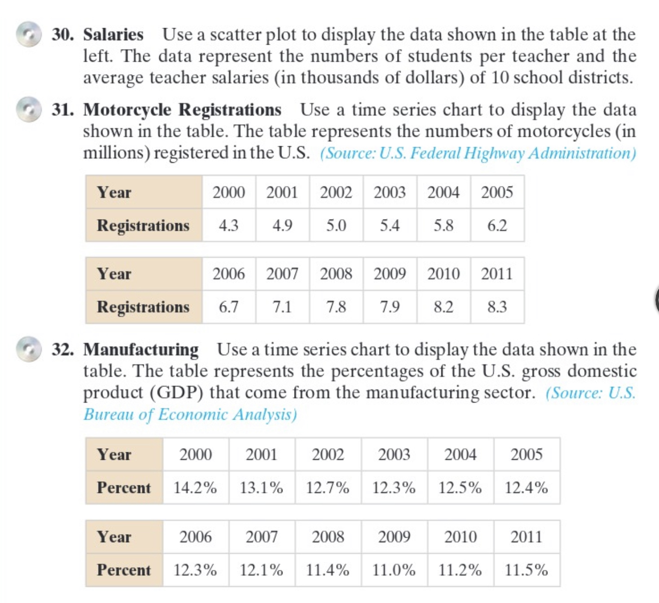

30. Salaries Use a scatter plot to display the data shown in the table at the left. The data represent the numbers of students per teacher and the average teacher salaries (in thousands of dollars) of 10 school districts. 31. Motorcycle Registrations Use a time series chart to display the data shown in the table. The table represents the numbers of motorcycles (in millions) registered in the U.S. (Source: U.S. Federal Highway Administration) Year 2000 2001 2002 2003 2004 2005 Registrations 4.3 4.9 5.0 5.4 5.8 6.2 Year 2006 2007 2008 2009 2010 2011 Registrations 6.7 7.1 7.8 7.9 8.2 8.3 32. Manufacturing Use a time series chart to display the data shown in the table. The table represents the percentages of the U.S. gross domestic product (GDP) that come from the manufacturing sector. (Source: U.S. Bureau of Economic Analysis) Year 2000 2001 2002 2003 2004 2005 Percent 14.2% 13.1% 12.7% 12.3% 12.5% 12.4% Year 2006 2007 2008 2009 2010 2011 Percent 12.3% 12.1% 11.4% 11.0% 11.2% 11.5%
Step by Step Solution
There are 3 Steps involved in it

Get step-by-step solutions from verified subject matter experts