

Question: A3 Inf Tech Rubric BDAT1005-22S (Protected View) - Word File Home Insert Draw Design Layout References Help Tell me what you want to do
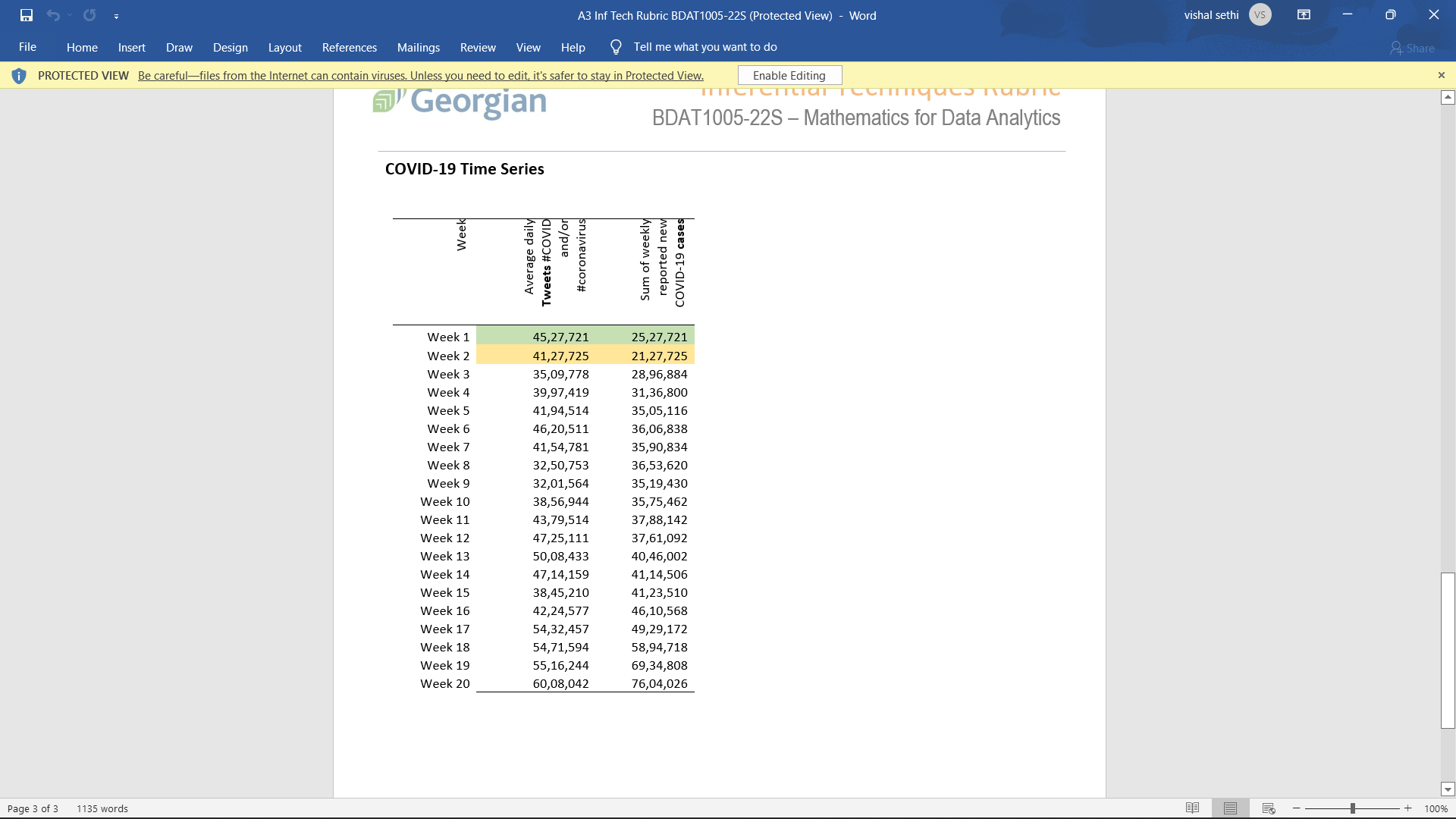
A3 Inf Tech Rubric BDAT1005-22S (Protected View) - Word File Home Insert Draw Design Layout References Help Tell me what you want to do Enable Editing Mailings Review View PROTECTED VIEW Be careful-files from the Internet can contain viruses. Unless you need to edit, it's safer to stay in Protected View. Assignment Description As we have learned this term, inferential statistical techniques allow us to generalize results from samples to populations, and also to make predictions about future events. In this individual assignment, you will use the data in 'A3 Inf Tech BDAT1005-22W.xlsx' to explore the relationships of two variables over time during the COVID-19 pandemic. The assignment is graded out of 50 marks. Please read through each entire assignment before you start. Let's have some fun with a couple of very widely used applications of regression analysis! Remember, though, that for real data analyses, you must always examine your univariates first. Make sure your work and/or reasoning is shown, to validate every result - without that, a correct answer may only get half marks, and an incorrect answer none. You will need to 'set your data' in this assignment, using your nine-digit Georgian College student number; we'll represent your entire student number as XX2X3X4X5X6X7X8X9, so if your student number is 200123456 and we ask for the last five digits, X5X6X7X8X9, then you should use 23456. COVID Time Series (50 marks) You are given data in the 'Data' tab about Tweets that include the hashtags #COVID and/or #coronavirus and about new COVID-19 cases. For each of 20 consecutive weeks, you have the the daily average (mean) numbers of such Tweets and the total number of reported new cases. You must modify the first two weeks of data as follows. Fill the two missing Tweets cells with 4,000,000 plus the last six digits of your student number - in week 1, in normal order (4,000,000 + X4X5X6X7X8X9); in week 2, in reverse order (4,000,000 + X9X8X7X6X5X4). For example, if your student number were 200123456, the first week would be 4,123,456 and the second week would be 4,654,321. Fill the two missing Cases cells with 2,000,000 plus the last six digits of your student number - in week 1, in normal order (2,000,000 + X4X5X6X7X8X9); in week 2, in reverse order (2,000,000 + X9X8X7X6X5X4). Page 1 of 3 1135 words Change the 'Weeks' variable from alphanumeric to integers. Now you're ready to work on your assignment! 1. Create a line, bar or scatter chart showing average daily tweets (vertical) versus the week (horizontal) (6 marks), making sure that the chart is appropriately labelled and scaled. 2. Add a linear trend-line (4 marks). It should also be appropriately labelled, making sure to get full accurate values for the slope and y-intercept of the trend-line. 3. Using the Data Analysis Toolpak, create a regression analysis of this same relationship, with the output on a separate worksheet. Include labels, and all output options for residuals and normal probability. (2 marks) a. What is the predictor variable's t-statistic in the t-test? Is this statistically significant for an unusually strict 99.5% CL? (2 marks) HINT: You can use the t-test coefficients to help with q4. 4. In the 'Questions' tab, answer the following questions about your first chart: a. Based on your linear regression line, what is the projected number of tweets in week 21? Your answer should be rounded to the nearest integer. (2 marks) b. Is the correlation between tweets and time (weeks) positive or negative? Is it strong or weak? (2 marks) vishal sethi vs Share + 100% x A3 Inf Tech Rubric BDAT1005-22S (Protected View) - Word File Home Insert Draw Design Layout References Mailings Review View Help Tell me what you want to do Enable Editing PROTECTED VIEW Be careful-files from the Internet can contain viruses. Unless you need to edit, it's safer to stay in Protected View. Page 2 of 3 1135 words vishal sethi vs Share C. Georgian Inferential Techniques Rubric BDAT1005-22S - Mathematics for Data Analytics To two decimal places, what percentage of the variation in the number of tweets is explained by the passage of time? Can you trust that figure? (2 marks) 5. Create a scatter chart showing number of cases (vertical) versus average daily tweets (horizontal) (6 marks), making sure that the chart is appropriately labelled and scaled. 6. Add a linear trend-line (2 marks) to the new chart. It should also be appropriately labelled, making sure to get full accurate values for the slope and y-intercept of the trend-line. 7. Using the Data Analysis Toolpak, create a regression analysis of this same relationship, with the output on a separate worksheet. Include labels, and all output options for residuals and normal probability. (2 marks) a. What is the predictor variable's t-statistic in the t-test? Is this statistically significant for an unusually strict 99.5% CL? (2 marks) HINT: You can use the t-test coefficients to help with 98. 8. In the 'Questions' tab, answer the following questions about the new chart: a. What is the projected number of COVID-19 cases in week 21? Your answer should be rounded to the nearest integer. Note that you will need to approach this question indirectly, using your answer from question 4(a) above. (3 marks) b. This chart suggests that one variable is independent (cause), and the other is dependent (result). Which variable does this chart suggest is independent? (1 mark) C. d. In this chart, is the correlation positive or negative, strong or weak? Does the suggested direction of causality make sense to you? Why? (2 marks) How much of the variation in the dependent variable is explained by the variation in the independent variable? Can you trust that figure? Could there be any other reasons for this correlation? (3 marks) 9. Comment about your entire analysis: a. As a data analyst, using all you have learned here, what does this statistical evidence suggest to you? (3 marks) Does your analysis lead to any actionable measure or have any predictive value? (2 marks) b. c. What words and charts would you share with an audience, to help share this knowledge? (4 marks) Evaluation The assignment is marked out of 50, and worth 5% of the course, with the marks distributed as shown above. Submissions Your submission should include just one Excel spreadsheet that includes your modifications, output and answers along with the original raw data. Submit your results in the 'Assignments & Tests' folder in our Blackboard shell for this course. + 100% x Page 3 of 3 1135 words File Home Insert Draw Design Layout References Mailings Review View Help Tell me what you want to do PROTECTED VIEW Be careful-files from the Internet can contain viruses. Unless you need to edit, it's safer to stay in Protected View. Georgian Enable Editing TICICITtar reemques napTIC BDAT1005-22S - Mathematics for Data Analytics COVID-19 Time Series Week Average daily Tweets #COVID and/or #coronavirus A3 Inf Tech Rubric BDAT1005-22S (Protected View) - Word Sum of weekly reported new COVID-19 cases Week 1 Week 2 45,27,721 25,27,721 41,27,725 21,27,725 Week 3 35,09,778 28,96,884 Week 4 39,97,419 31,36,800 Week 5 41,94,514 35,05,116 Week 6 46,20,511 36,06,838 Week 7 41,54,781 35,90,834 Week 8 32,50,753 36,53,620 Week 9 32,01,564 35,19,430 Week 10 38,56,944 35,75,462 Week 11 43,79,514 37,88,142 Week 12 47,25,111 37,61,092 Week 13 50,08,433 40,46,002 Week 14 47,14,159 41,14,506 Week 15 38,45,210 41,23,510 Week 16 42,24,577 46,10,568 Week 17 54,32,457 49,29,172 Week 18 54,71,594 58,94,718 Week 19 55,16,244 69,34,808 Week 20 60,08,042 76,04,026 + 100% vishal sethi vs Share x
Step by Step Solution
There are 3 Steps involved in it

Get step-by-step solutions from verified subject matter experts