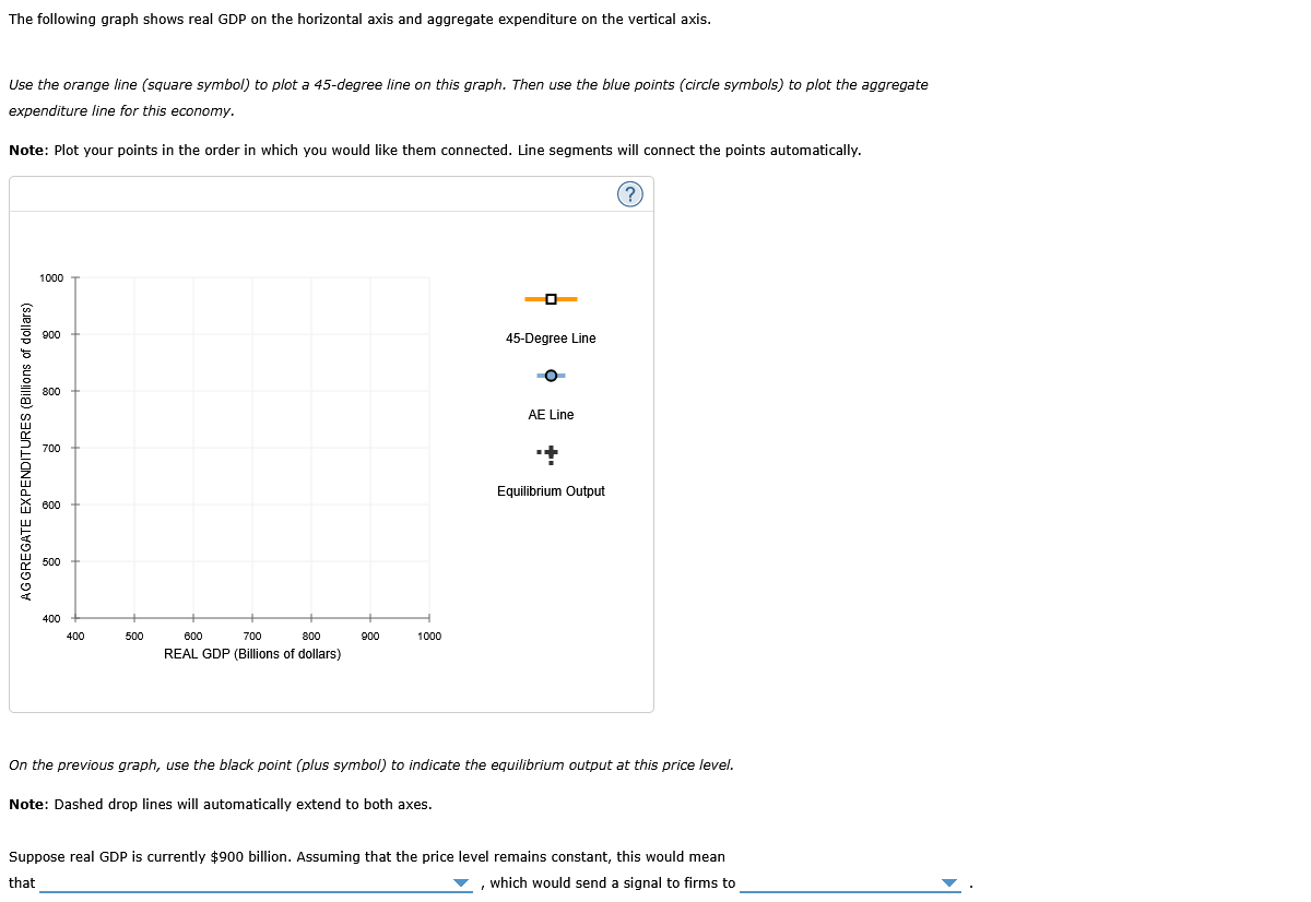
Question: answer question and graph The following graph shows real GDP on the horizontal axis and aggregate expenditure on the vertical axis. Use the orange line

answer question and graph

answer question and graph The following graph
The following graph shows real GDP on the horizontal axis and aggregate expenditure on the vertical axis. Use the orange line (square symbol!) to plot a 45-degree line an this graph. Then use the blue points (circle symbols) to plot the aggregate expenditure fine for this economy. Note: Plot your points in the order in which you would like them connected. Line segments will connect the points automatically. @ 1000 0 900 7 45-Degree Line Oo 800 AE Line 700 + 't Equilibrium Qutput AGGREGATE EXPENDITURES (Billions of dollars) 490 4 400 500 600 700 800 900 1000 REAL GDP (Billions of dollars) On the previous graph, use the black point (plus symbol) to indicate the equilibrium output at this price level. Note: Dashed drop lines will automatically extend to both axes. Suppose real GDP is currently $900 billion. Assuming that the price level remains constant, this would mean that ~w , which would send a signal to firms to

Step by Step Solution

There are 3 Steps involved in it

1 Expert Approved Answer
Step: 1 Unlock blur-text-image
Question Has Been Solved by an Expert!

Get step-by-step solutions from verified subject matter experts

Step: 2 Unlock
Step: 3 Unlock

Students Have Also Explored These Related Mathematics Questions!