

Question: Assignment 2 - Graphing 01 5 Points Women in the United States continue to be paid less than men overall. Nationally, in 2020, the median


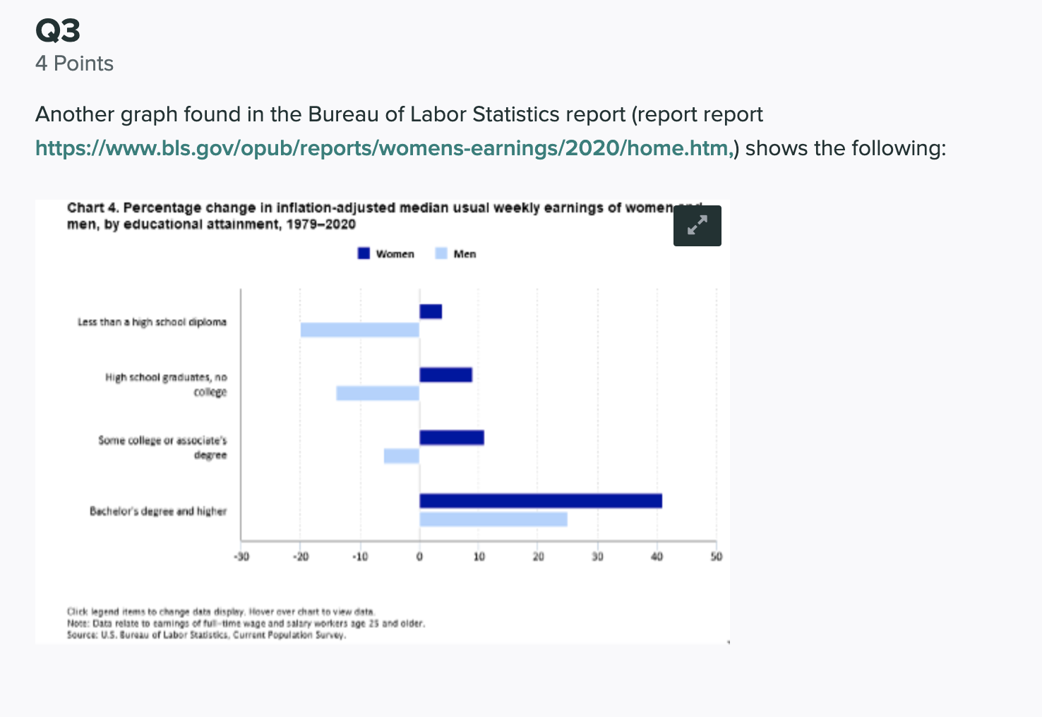

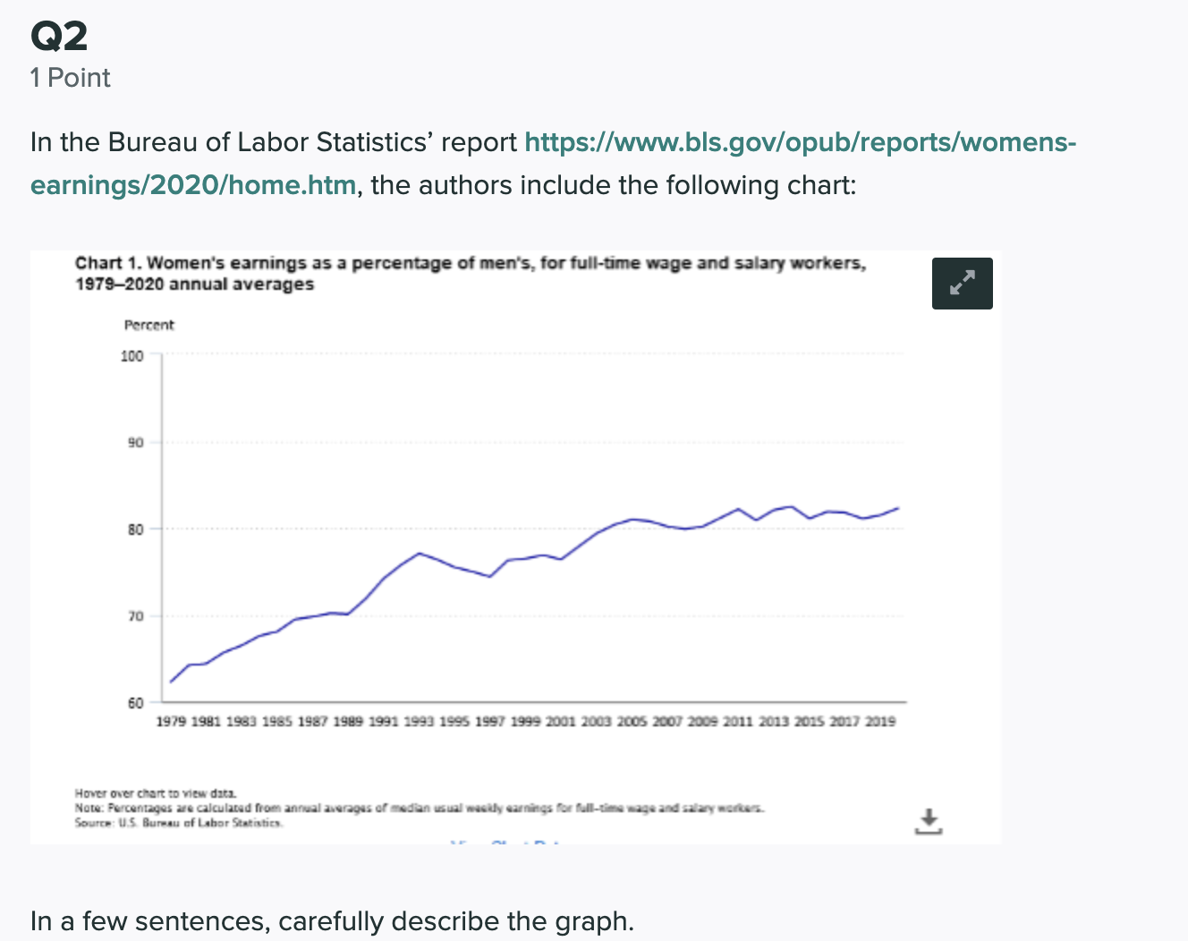


Assignment 2 - Graphing 01 5 Points Women in the United States continue to be paid less than men overall. Nationally, in 2020, the median weekly earnings of female fulltime wage and salary workers totaled $891, while it was $1082 for males. {Data is from the Bureau of Labor Statistics report httpszllwww.bls.gov/opub/reports/womens-earnings/2020/home.htm) 01.1 1 Point In 2020, male fulltime wage and salary workers earned what _% more than female fulltime wage and salary workers. Enter your answer here In 2020, female full-time wage and salary workers earned _ 96 less than male full-time wage and salary workers. Enter your answer here Save Answer 01.2 1 Point What percent of male fulltime wage and salary worker median weekly earnings does the female median weekly earnings represent? (This percentage is often called the womento men's earning ratio.) Enter your answer here 01.3 1 Point Enter the data above in Excel {$891 for females and $1082 for males), make a bar chart that purposely exaggerates the difference between men and women. Select your chart in Excel, right click on it and choose Save as Picture. Upload the saved picture to the field below. (You can also simply take a screen shot if that is easier) E Please select fi|e(s) Select file(s) Save Answer 01.4 1 Point Using the data above above ($891 for females and $1082 for males), make a bar chart that purposely makes the difference between men and women seem small. Select your chart in Excel, right click on it and choose Save as Picture. Upload the saved picture to the field below. (You can also simply take a screen shot if that is easier) E Please select fi|e(s) Select file(s) Save Answer 01.5 1 Point In the spirit of the story of Goldilocks, make a graph of the data that you feel gives the most accurate, non-biased view of the difference between male and female wages. Select your chart in Excel, right click on it and choose Save as Picture. Upload the saved picture to the field below. (You can also simply take a screen shot if that is easier) Q Please select fi|e(5) Select file(s) Save Answer Q2 1 Point In the Bureau of Labor Statistics' report https://www.bls.gov/opub/reports/womens- earnings/2020/home.htm, the authors include the following chart: Chart 1. Women's earnings as a percentage of men's, for full-time wage and salary workers, 1979-2020 annual averages Percent 100 90 80 70 60 1979 1981 1983 1985 1987 1989 1991 1993 1995 1997 1999 2001 2003 2005 2007 2009 2011 2013 2015 2017 2019 Hover over chart to view ditz. Note: Percentages are calculated from annual averages of median usual wasily earnings for full-time no wage and salary workers. Source: U.5. Bureau of Labor Statistics. In a few sentences, carefully describe the graph.Q3 4 Points Another graph found in the Bureau of Labor Statistics report (report report https://www.bls.gov/opub/reports/womens-earnings/2020/home.htm,) shows the following: Chart 4. Percentage change in inflation-adjusted median usual weekly earnings of women men, by educational attainment, 1979-2020 Women Men Less than a high school diploma High school graduates, no college Some college or associate's degree Bachelor's degree and higher -20 -10 10 20 50 Click legend items to change dats display. Hover over chart to view data. Note: Data relate to tamings of full-time wage and salary workers age 25 and older. Source: U.S. Bureau of Labor Statistics, Current Population Survey.03.1 1 Point What type of graph is this graph? Enter your answer here Save Answer 03.2 2 Points The graph shows that women with bachelor's degree or higher earn more than men with bachelor's degrees or higher. O True O False Briefly explain your answer. Enter your answer here 03.3 1 Point In a 5-7 sentence paragraph, carefully describe what this graph tells about changes in women's and men's earnings from 1979 to 2020. Address the following questions in your paragraph: . The changes in the data across the categories. (Compare men and women.) - The changes in the data within the categories. (Only look at women and then only look at men.) Enter your answer here
Step by Step Solution
There are 3 Steps involved in it

Get step-by-step solutions from verified subject matter experts