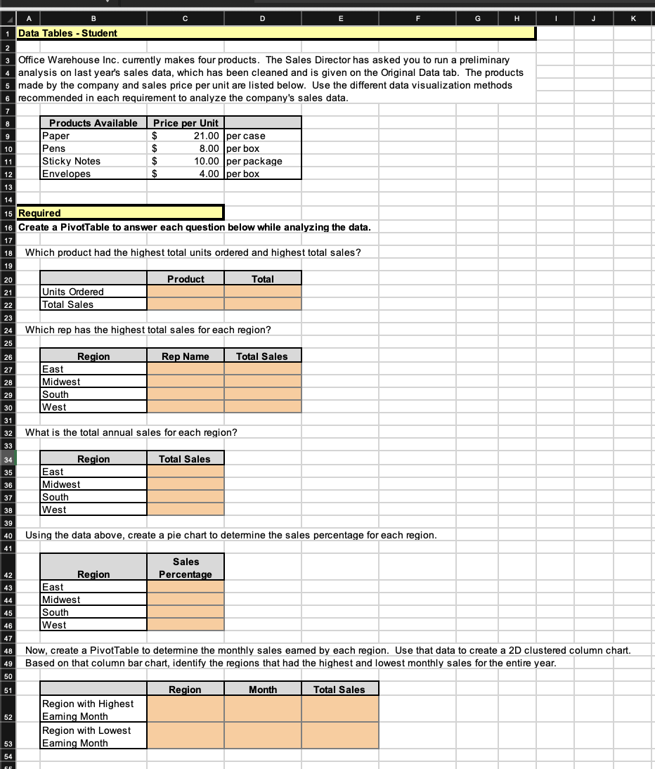
Question: B C G H Data Tables - Student Office Warehouse Inc. currently makes four products. The Sales Director has asked you to run a preliminary

B C G H Data Tables - Student Office WarehouseB C G H Data Tables - Student Office WarehouseB C G H Data Tables - Student Office WarehouseB C G H Data Tables - Student Office Warehouse
B C G H Data Tables - Student Office Warehouse Inc. currently makes four products. The Sales Director has asked you to run a preliminary analysis on last year's sales data, which has been cleaned and is given on the Original Data tab. The products made by the company and sales price per unit are list are listed below. Use the different data visualization methods recommended in each requirement to analyze the company's sales data. Products Available Price per Unit Paper 21.00 per case Pen 8.00 per box Sticky Notes 10.00 per package Envelopes 4.00 per box 15 Required Create a PivotTable to answer each question below while analyzing the data. Which product had the highest total units ordered and highest total sales? 20 Product Total Units Ordered 22 Total Sales Which rep has the highest total sales for each region? 25 26 Region Rep Name Total Sales East 28 Midwest South West 32 What is the total annual sales for each region? Region Total Sales 35 East Midwest South West 40 Using the data above, create a pie chart to determine the sales percentage for each region. 41 Sales 42 Region Percentage 43 East Midwest South West Now, create a PivotTable to determine the monthly sales earned by each region. Use that data to create a 2D clustered column chart. 49 Based on that column bar chart, identify the regions that had the highest and lowest monthly sales for the entire year. 50 51 Region Month Total Sales Region with Highest 52 Earning Month Region with Lowest 53 Earning MonthRequired information [The following information applies to the questions displayed below.] Part 1 of 2 This Applying Excel worksheet includes an explanation of the Pivot Table and other Data Visualization charts. 10 points Download the Applying Excel form below. Follow the tutorial on the first tab using Excel 's Pivot Table function and Charts. Skipped After following the tutorial to create a PivotTable, your final table should match the table shown below. Sum of Total Order Column Labels eBook Grand Row Labels Agendas Folders Notebooks Total IA $110.00 $ 26.00 $ 33.75 $ 169.75 References IL $470.00 $ 30.00 $ 22.50 522.50 IN 7.60 $ 63. 75 71.35 KY $275. 00 9.00 $ 18.75 302.75 OH + 55.50 55.50 TN $ 13.00 13.00 WI $ 38.00 $ 56. 25 94.25 Grand Total $855. 00 $123.60 $250 . 50 $1, 229. 10 Check your Pivot Table setup by changing the original data on the Data Visualization - Tutorial tab. Change the values in cells G3:H6 as seen below. Price per Product Unit Notebooks $1. 00 Folders $0. 10 Agendas $4. 50 After refreshing the Pivot Table data, the total order in KY of folders purchased should be $4.50 and the Grand Total for all states and products should be $1,165.30 If you did not get these answers, try to refresh the data again for the Pivot Table and follow the tutorial steps again. Save your completed Applying Excel form to your computer and then upload it here by clicking "Browse". Next click "Save". You will use this worksheet to answer questions in Part 2. upload a response file (15MB max) download reference file Choose File no file selected ApplyingExcel_DataVisualization_Student.xIsx saveOn the Data Visualization Student tab in your Excel spreadsheet, update the price per unit for all four products for Office Warehouse Inc. with the data below: Products Available Price per Unit Paper $19.09 per case Pens $ 9.88 per box Sticky Notes $ 8.50 per package Envelopes $ 4.50 per box Required: Create a Pivot Table and determine the following information while analyzing the data: 2. Which product has the highest total units ordered and the highest total sales? (Enter your Units Ordered to the nearest whole unit and your Total Sales to 2 decimal places.) Units Ordered Total Sales 3. Which rep has the highest total sales for each region? (Enter your Total Sales to 2 decimal places.) 4. What is the total annual sales for each region? (Enter your Total Sales to 2 decimal places.) 5. Using the data from requirement 4, create a pie chart to determine the sales percentage for each region. {Enter your Sales Percentage to the nearest whole percent) 6. Now, using the Pivot Table, determine the monthly sales earned by each region. Use that data to create a 2D clustered column chart. Based on that column bar chart, identify the regions that had the highest and lowest monthly sales for the entire yea r. {Enter your Total Sales to 2 decimal places.) --- Month --- Month

Step by Step Solution

There are 3 Steps involved in it

1 Expert Approved Answer
Step: 1 Unlock blur-text-image
Question Has Been Solved by an Expert!

Get step-by-step solutions from verified subject matter experts

Step: 2 Unlock
Step: 3 Unlock

Students Have Also Explored These Related Accounting Questions!