

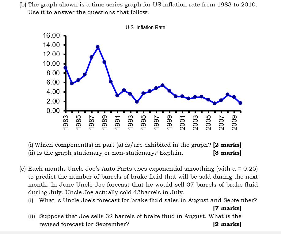
Question: (b) The graph shown is a time series graph for US inflation rate from 1983 to 2010. Use it to answer the questions that follow.
Step by Step Solution
There are 3 Steps involved in it
1 Expert Approved Answer
Step: 1 Unlock

Question Has Been Solved by an Expert!
Get step-by-step solutions from verified subject matter experts
Step: 2 Unlock
Step: 3 Unlock