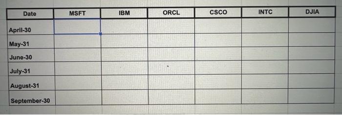
Question: begin{tabular}{|c|c|c|c|c|c|c|c|} hline multicolumn{1}{|c|}{ Date } & MSFT & IBM & ORCL & CSCO & INTC & DJIA hline April-30 & & & & &
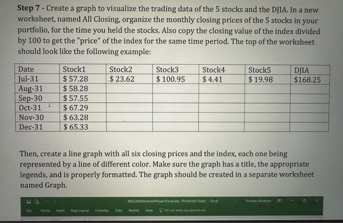
\begin{tabular}{|c|c|c|c|c|c|c|c|} \hline \multicolumn{1}{|c|}{ Date } & MSFT & IBM & ORCL & CSCO & INTC & DJIA \\ \hline April-30 & & & & & & \\ \hline May-31 & & & & & & \\ \hline June-30 & & & & & & \\ \hline July-31 & & & & & & & \\ \hline August-31 & & & & & & & \\ \hline September-30 & & & & & & & \\ \hline \end{tabular} Step 7 -Create a graph to visualize the trading data of the 5 stocks and the DJIA. In a new worksheet, named All Closing, organize the monthly closing prices of the 5 stocks in your portfolio, for the time you held the stocks. Also copy the closing value of the index divided by 100 to get the "price" of the index for the same time period. The top of the worksheet should look like the following example: Then, create a line graph with all six closing prices and the index, each one being represented by a line of different color. Make sure the graph has a title, the appropriate legends, and is properly formatted. The graph should be created in a separate worksheet named Graph. Step 7 -Create a graph to visualize the trading data of the 5 stocks and the DJIA. In a new worksheet, named All Closing, organize the monthly closing prices of the 5 stocks in your portfolio, for the time you held the stocks. Also copy the closing value of the index divided by 100 to get the "price" of the index for the same time period. The top of the worksheet should look like the following example: Then, create a line graph with all six closing prices and the index, each one being represented by a line of different color. Make sure the graph has a title, the appropriate legends, and is properly formatted. The graph should be created in a separate worksheet named Graph. \begin{tabular}{|c|c|c|c|c|c|c|c|} \hline \multicolumn{1}{|c|}{ Date } & MSFT & IBM & ORCL & CSCO & INTC & DJIA \\ \hline April-30 & & & & & & \\ \hline May-31 & & & & & & \\ \hline June-30 & & & & & & \\ \hline July-31 & & & & & & & \\ \hline August-31 & & & & & & & \\ \hline September-30 & & & & & & & \\ \hline \end{tabular} Step 7 -Create a graph to visualize the trading data of the 5 stocks and the DJIA. In a new worksheet, named All Closing, organize the monthly closing prices of the 5 stocks in your portfolio, for the time you held the stocks. Also copy the closing value of the index divided by 100 to get the "price" of the index for the same time period. The top of the worksheet should look like the following example: Then, create a line graph with all six closing prices and the index, each one being represented by a line of different color. Make sure the graph has a title, the appropriate legends, and is properly formatted. The graph should be created in a separate worksheet named Graph. Step 7 -Create a graph to visualize the trading data of the 5 stocks and the DJIA. In a new worksheet, named All Closing, organize the monthly closing prices of the 5 stocks in your portfolio, for the time you held the stocks. Also copy the closing value of the index divided by 100 to get the "price" of the index for the same time period. The top of the worksheet should look like the following example: Then, create a line graph with all six closing prices and the index, each one being represented by a line of different color. Make sure the graph has a title, the appropriate legends, and is properly formatted. The graph should be created in a separate worksheet named Graph