

Question: begin{tabular}{c|l} hline 7 & Insert a scatter plot with course rating as the x axis values and GPA as the y axis values. Be sure
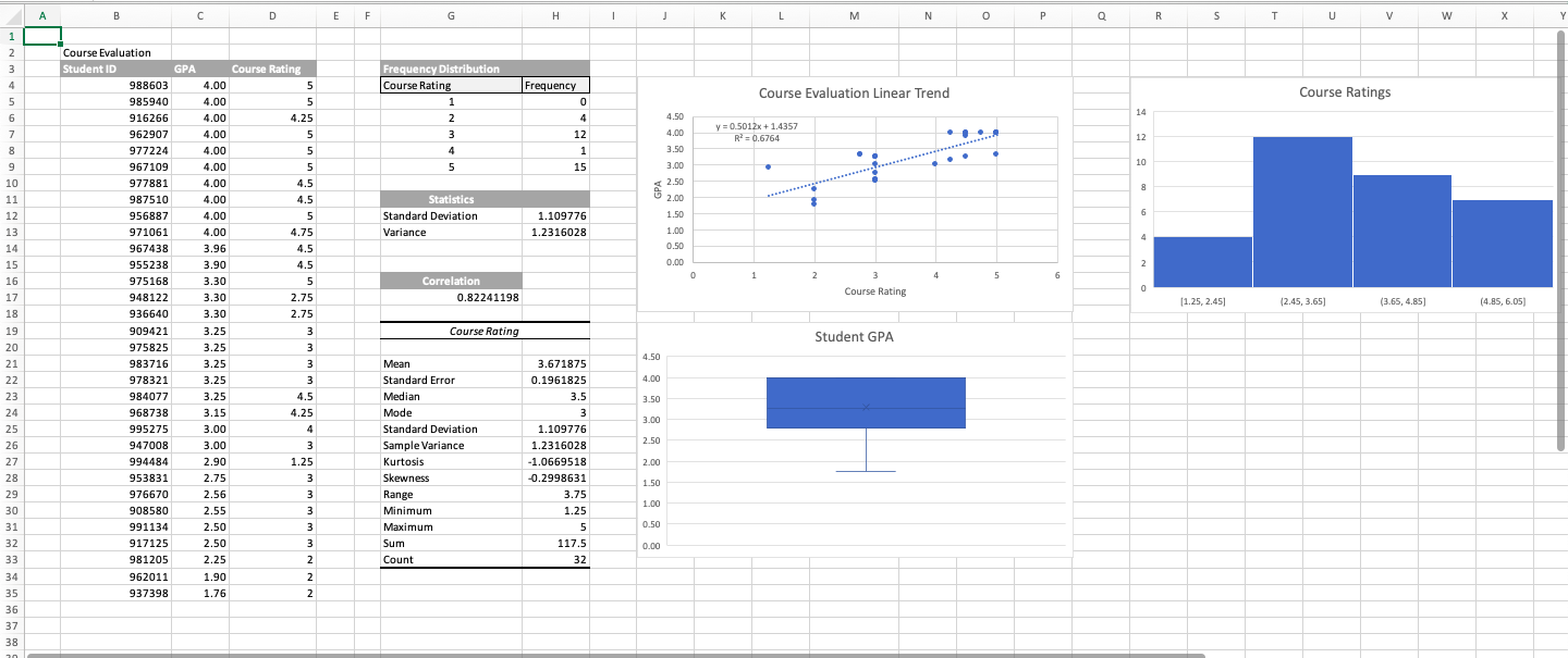
\begin{tabular}{c|l} \hline 7 & Insert a scatter plot with course rating as the x axis values and GPA as the y axis values. Be sure to add appropriate chart and axis labels. \\ \hline 8 & Add a linear trend line to the scatter plot with the equation and R-square displayed on the chart. \\ \hline 9 & Position the chart so the upper-left corner is in cell J4 and move the equation displayed on the chart to the upper-left corner of the plot area. \\ \hline 10 & Insert a box and whisker chart based on the GPA values located in column C. Add an appropriate chart title and delete the x axis label. Place the chart so the upper-left corner is in cell J19. \\ 11 & Insert a histogram based on course ratings located in column D. Add an appropriate chart title and position the chart so the upper-left corner is in cell R4. \end{tabular} =
Step by Step Solution
There are 3 Steps involved in it

Get step-by-step solutions from verified subject matter experts