

Question: Below are two graphs, for the 50 states and the District of Columbia, showing for two periods (1950-1930 and 1980-2020) the per-capita income in each
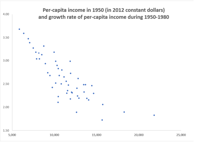
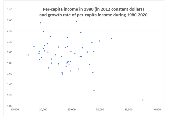
Below are two graphs, for the 50 states and the District of Columbia, showing for two periods (1950-1930 and 1980-2020) the per-capita income in each state at the starting year and the subsequent average annual growth rate of per-capita income in the succeeding years. (1) Which of the two gures supports the Solow growth theory? Explain. (2) What is the advantage of using data for the states comprising the US, rather than data for the 180+ economies in the world? (3) Provide an explanation for why the two graphs differ. Per-capita income in 1950 (in 2012 constant dollars) 4.00 and growth rate of per-capita income during 1950-1980 3.50 3.00 2.50 2.00 1.50 5,000 10,000 15,000 20,000 25,0002.80 Per-capita income in 1980 (in 2012 constant dollars) and growth rate of per-capita income during 1980-2020 2.60 2.40 2.20 2.00 1.80 1.60 1.40 1.20 1.00 15,000 20,000 25,000 30,000 35,000 40,000
Step by Step Solution
There are 3 Steps involved in it

Get step-by-step solutions from verified subject matter experts