

Question: Can someone show me how to plot a chart for # 8 and the scales you use? I am using Tableau but any other platform
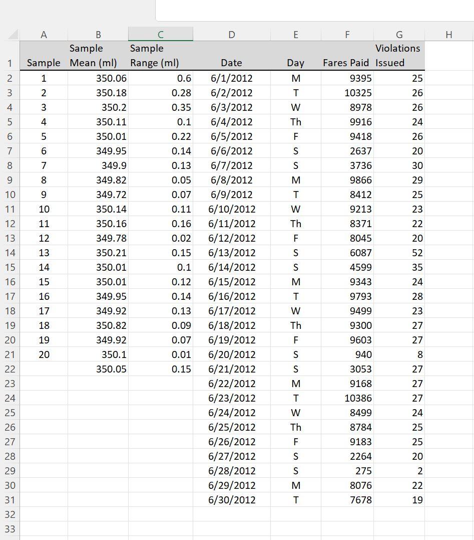
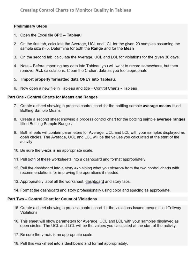 Can someone show me how to plot a chart for # 8 and the scales you use? I am using Tableau but any other platform will do. If you could also help me with the rest of the questions that would be great also.
Step by Step Solution
There are 3 Steps involved in it
1 Expert Approved Answer
Step: 1 Unlock

Question Has Been Solved by an Expert!
Get step-by-step solutions from verified subject matter experts
Step: 2 Unlock
Step: 3 Unlock