

Question: Can you describe ways in which data visualizations make information more accessible to their audience? What would you recommend to make key insights in visualizations
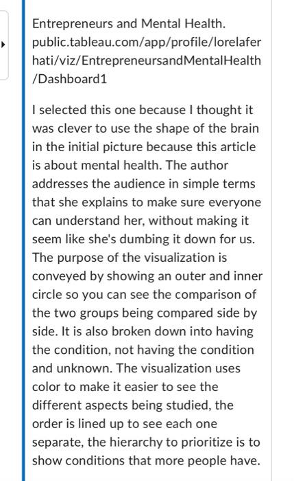
Can you describe ways in which data visualizations make information more accessible to their audience? What would you recommend to make key insights in visualizations more digestible to your audience? What would you avoid? Entrepreneurs and Mental Health. public.tableau.com/app/profile/lorelafer hati/viz/EntrepreneursandMentalHealth /Dashboard1 I selected this one because I thought it was clever to use the shape of the brain in the initial picture because this article is about mental health. The author addresses the audience in simple terms that she explains to make sure everyone can understand her, without making it seem like she's dumbing it down for us. The purpose of the visualization is conveyed by showing an outer and inner circle so you can see the comparison of the two groups being compared side by side. It is also broken down into having the condition, not having the condition and unknown. The visualization uses color to make it easier to see the different aspects being studied, the order is lined up to see each one separate, the hierarchy to prioritize is to show conditions that more people have
Step by Step Solution
There are 3 Steps involved in it

Get step-by-step solutions from verified subject matter experts