

Question: Can you help me with this code to help it look like the figure in Figure 7.56? for project 2 7.9 Chapter Summary 319 ght
Can you help me with this code to help it look like the figure in Figure 7.56?
for project 2
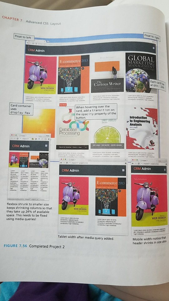
7.9 Chapter Summary 319 ght Trving resizing the browser; notice how the flex containers continue to shrink in width in order to maintain the four columns. Why four columns? Remember back in step three we set the width to 24%, so the browser is trying to maintain that rule. Add a media query for screens 480 px wide and less. In it, change the card width to 100% and test. Now on a small screen, each card will fill the entire width. Also reduce the height of the header as well as the margin and padding of its heading. 9. Add a media query for tablets between 481 px and 768 px. Change the card width so two cards are displayed on each row. as 24% 10. Add a 2 second transition on the opacity property when hovering over or off of the See More span with the button class This will create the illusion of the span fading into (or out of) visibility. Also, add a drop shadow and a saturation filter of about 130% when hovering over any of the card mages Testing I. View chapter07-project02.html in the browser. Be sure to test at different sizes to verify the media queries work as expected (see Figure 7.56) PROJECT3 Share YouL Travel Photos 7.9 Chapter Summary 319 ght Trving resizing the browser; notice how the flex containers continue to shrink in width in order to maintain the four columns. Why four columns? Remember back in step three we set the width to 24%, so the browser is trying to maintain that rule. Add a media query for screens 480 px wide and less. In it, change the card width to 100% and test. Now on a small screen, each card will fill the entire width. Also reduce the height of the header as well as the margin and padding of its heading. 9. Add a media query for tablets between 481 px and 768 px. Change the card width so two cards are displayed on each row. as 24% 10. Add a 2 second transition on the opacity property when hovering over or off of the See More span with the button class This will create the illusion of the span fading into (or out of) visibility. Also, add a drop shadow and a saturation filter of about 130% when hovering over any of the card mages Testing I. View chapter07-project02.html in the browser. Be sure to test at different sizes to verify the media queries work as expected (see Figure 7.56) PROJECT3 Share YouL Travel Photos
Step by Step Solution
There are 3 Steps involved in it

Get step-by-step solutions from verified subject matter experts
 Study Help