

Question: Completion Status: QUESTION 6 Randomly pick a grade from a section, and calculate the difference of the grade from its section mean value. The biggest
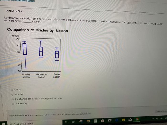
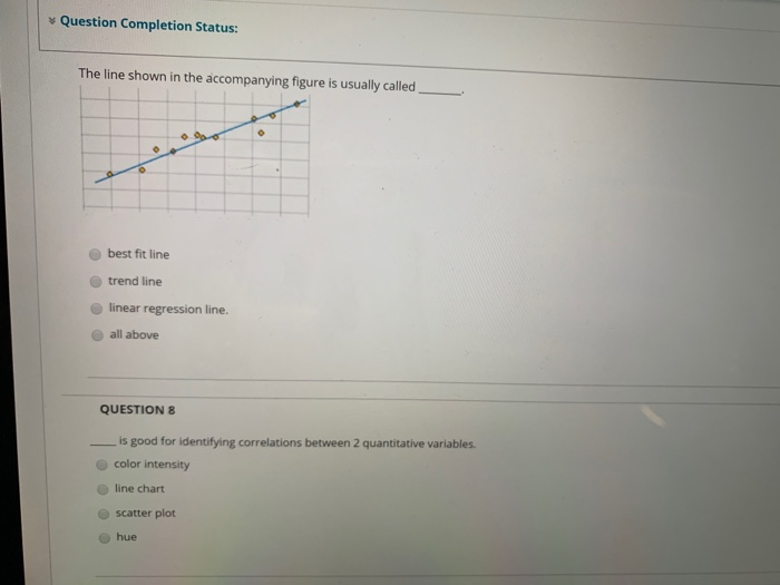
Completion Status: QUESTION 6 Randomly pick a grade from a section, and calculate the difference of the grade from its section mean value. The biggest difference would most possibly come from the section. Comparison of Grades by Section grade 100 88 HD 601 Monday section Wednesday section Friday section Friday Monday the chances are all equal among the 3 sections. Wednesday SAA Click Save and Submit to save and submit. Click Save All Answers to me all answers. Start a web search Question Completion Status: The line shown in the accompanying figure is usually called best fit line trend line linear regression line. all above QUESTION 8 is good for identifying correlations between 2 quantitative variables. color intensity line chart scatter plot hue hue QUESTION 9 is a common choice for displaying distributions over time. Box-plot Fishbone diagram XY-chart Scatter plot QUESTION 10 The Box plot is good for showing quantitative variables. showing distributions, showing categorical variables showing combinations of quantitative and categorical variables Click Save and Submit to save and submit. Click Save All Answers to save all answers
Step by Step Solution
There are 3 Steps involved in it

Get step-by-step solutions from verified subject matter experts