

Question: Continuing with the same data set. Use Microsoft Excel or Tableau or one of the other visualization tools and create 3 visuals(graphs/charts): First chart should
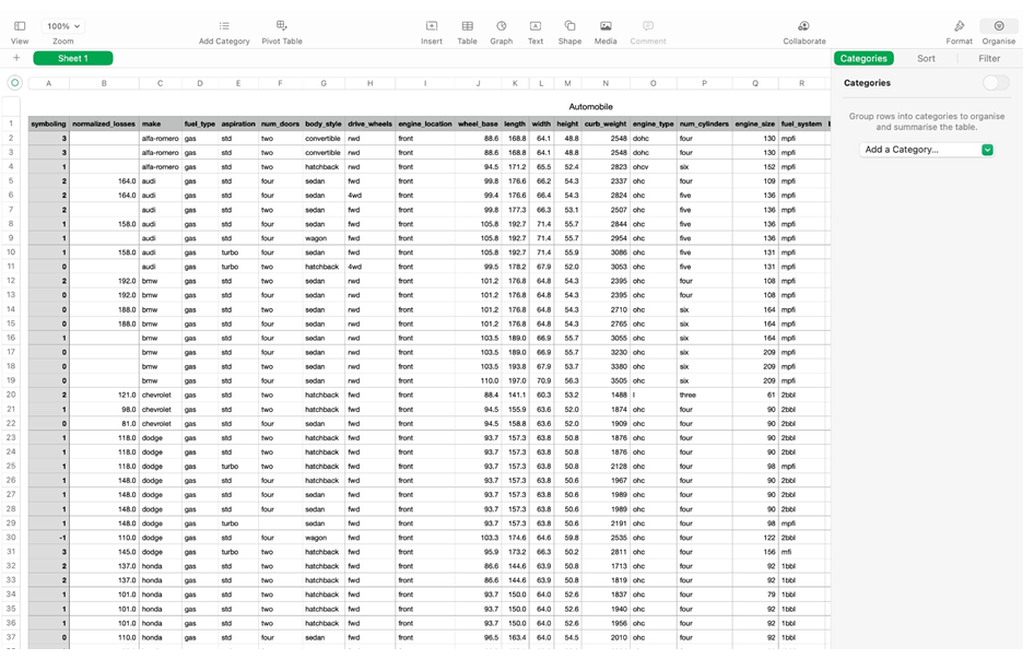
Continuing with the same data set.
Use Microsoft Excel or Tableau or one of the other visualization tools and create 3 visuals(graphs/charts):
First chart should at-least use 2 data columns
Second chart should at-least use 3 data columns
Third chart should also use at-least 3 data columns
These charts should show the legends correctly.
Take screens shots and explain the dependencies that you have shown in these visuals in your report to submit.
Group rows into categories to organise and summarise the table
Step by Step Solution
There are 3 Steps involved in it
1 Expert Approved Answer
Step: 1 Unlock

Question Has Been Solved by an Expert!
Get step-by-step solutions from verified subject matter experts
Step: 2 Unlock
Step: 3 Unlock