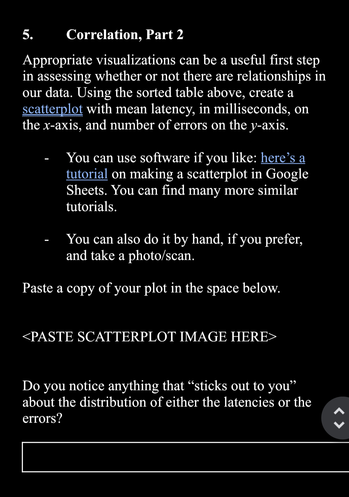
Question: Correlation, Part 2 Appropriate visualizations can be a useful first step in assessing whether or not there are relationships in our data. Using the sorted
Correlation, Part
Appropriate visualizations can be a useful first step in assessing whether or not there are relationships in our data. Using the sorted table above, create a scatterplot with mean latency, in milliseconds, on the axis, and number of errors on the axis.
You can use software if you like: here's a tutorial on making a scatterplot in Google Sheets. You can find many more similar tutorials.
You can also do it by hand, if you prefer, and take a photoscan
Paste a copy of your plot in the space below.

Step by Step Solution
There are 3 Steps involved in it
1 Expert Approved Answer
Step: 1 Unlock


Question Has Been Solved by an Expert!
Get step-by-step solutions from verified subject matter experts
Step: 2 Unlock
Step: 3 Unlock


