

Question: Create a scatter plot to represent the data. Label both axes. Just by looking at the plotted data, state whether there appears to be a
Create a scatter plot to represent the data. Label both axes.
Just by looking at the plotted data, state whether there appears to be a strong correlation
between the two variables.
Determine the equation of the line of best fit and plot the line on your scatter plot.
Determine the coefficients of determination and correlation.
Based on the above, explain whether you think there is a correlation. Speculate why or
why not there is a correlation.
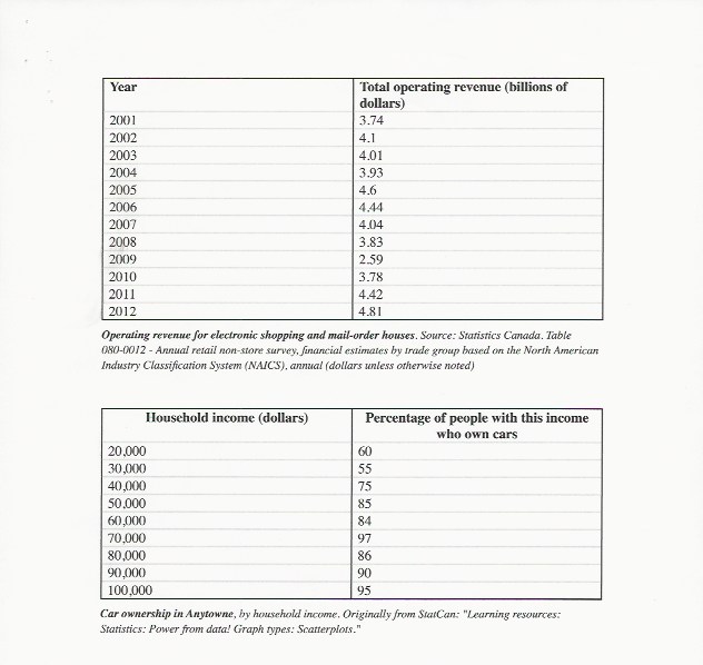
Year Total operating revenue (billions of dollars) 2001 3.74 2002 4.1 2003 4.01 2004 3.93 2005 4.6 2006 4.44 2007 4.04 2008 3.83 2009 2.59 2010 3.78 2011 4.42 2012 4.81 Operating revenue for electronic shopping and mail-order houses. Source: Statistics Canada. Table 080-0012 - Annual retail non-store survey, financial estimates by trade group based on the North American Industry Classification System (NAICS). annual (dollars unless otherwise noted) Household income (dollars) Percentage of people with this income who own cars 20.000 60 30,000 55 40,000 75 50.000 85 60.000 84 70,000 97 80,000 86 90,000 90 100,000 95 Car ownership in Anytowne, by household income. Originally from StarCan: "Learning resources: Statistics: Power from data! Graph types: Scatterplots."
Step by Step Solution
There are 3 Steps involved in it

Get step-by-step solutions from verified subject matter experts