

Question: . Data collected from the survey as below . . Question: Please do the statistical Analysis and descriptive analysis through SPSS. i need to do
.
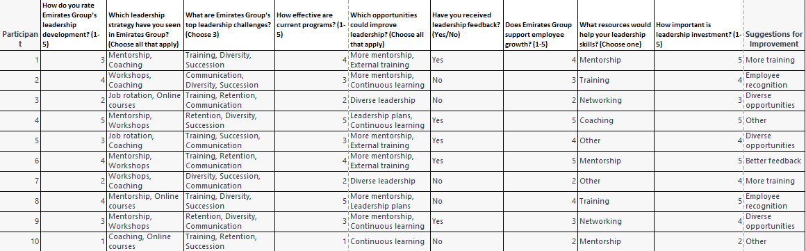
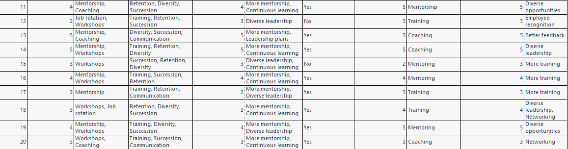
Data collected from the survey as below
.
.
Question: Please do the statistical Analysis and descriptive analysis through SPSS. i need to do as soon as possible? if you can also use the formula in excel how to do it?
To perform statistical and descriptive analysis on the given survey data in Excel, we can use various tools such as PivotTables, charts, and formulas. Below are the steps to analyze the data:
Step 1: Organize the data
Organize the survey data into a table with columns for each question and rows for each participant. Ensure that the data is clean and all the responses are properly recorded.
Step 2: Analyze the data using PivotTables
PivotTables are a powerful tool in Excel that can be used to summarize and analyze data. To create a PivotTable, select the table and go to the Insert tab in Excel, and select PivotTable.
For example, to analyze the responses to Question 1, drag the How do you rate Emirates Group's leadership development? field to the Rows area and the Count of How do you rate Emirates Group's leadership development? field to the Values area.
This will give a count of responses for each rating.
To calculate the mean, median, mode, and standard deviation of a particular column, we can use the following formulas in Excel:
Mean: =AVERAGE(range)
Median: =MEDIAN(range)
Mode: =MODE(range)
Standard deviation: =STDEV(range)
Where "range" is the range of cells we want to calculate the measure for.
.
Similarly, for Questions 2-5, drag the respective fields to the Rows and Values areas in the PivotTable. For example, to analyze the responses to Question 2, drag the Which leadership strategy have you seen in Emirates Group? field to the Rows area and the Count of Which leadership strategy have you seen in Emirates Group? field to the Values area. This will give a count of responses for each leadership strategy.
Step 3: Create charts to visualize the data
Charts are useful in visualizing the data and identifying trends. To create a chart, select the data and go to the Insert tab in Excel, and select the chart type.
For example, a bar chart can be used to visualize the responses to Question 1.
To create a pivot table to summarize the data, we can follow these steps:
Select the data range and go to the "Insert" tab.
Click on "Pivot Table" and select the range of data we want to analyze.
Choose the location of the pivot table (new worksheet or existing one).
Drag and drop the columns we want to analyze in the "Rows" and "Values" sections of the pivot table.
Apply any necessary filters or formatting to the pivot table.
To create a bar chart to visualize the data, we can follow these steps:
Select the data range and go to the "Insert" tab.
Click on "Bar Chart" and select the type of chart we want to create (e.g., stacked bar chart, clustered bar chart).
Customize the chart by adding titles, labels, and formatting.
.
Step 4: Use formulas to calculate averages and percentages
Excel has a range of formulas that can be used to calculate averages and percentages. For example, to calculate the average rating for Question 1, use the AVERAGE function. To calculate the percentage of participants who chose a particular response, divide the count of responses by the total number of participants and multiply by 100.
Step 5: Perform descriptive analysis
Descriptive analysis involves summarizing and describing the data. This can be done using PivotTables and charts as well as summary statistics such as mean, median, mode, standard deviation, and range. These statistics can be calculated using Excel formulas such as AVERAGE, MEDIAN, MODE, STDEV.S, and MIN-MAX.
Explanation:
To create a scatter plot to visualize the relationship between two variables, we can follow these steps:
Select the two columns we want to analyze.
Go to the "Insert" tab and click on "Scatter Chart."
Choose the type of scatter plot we want to create (e.g., scatter with straight lines, scatter with markers only).
Customize the chart by adding titles, labels, and formatting.
To calculate the correlation coefficient between two variables, we can use the following formula in Excel:
=CORREL(range1,range2)
Where "range1" and "range2" are the two ranges of cells we want to analyze.
By using these techniques, we can perform a thorough analysis of the survey data and draw meaningful conclusions from the results.
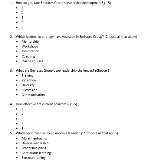
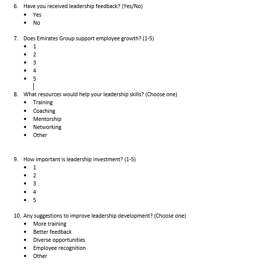
1. How do you rate Emirates Group's leadership development? (1-5) - 1 - 2 - 3 - 4 - 5 2. Which leadership strategy have you seen in Emirates Group? (Choose all that apply) - Mentorship - Workshops - Job rotation - Coaching - Online courses 3. What are Emirates Group's top leadership challenges? (Choose 3) - Training - Retention - Diversity - Succession - Communication 4. How effective are current programs? (1-5) - 1 - 2 - 3 - 4 - 5 5. Which opportunities could improve leadership? (Choose all that apply) - More mentorship - Diverse leadership - Leadership plans - Continuous learning - External training 6. Have you received leadership feedback? (Yes/No) - Yes - No 7. Does Emirates Group support employee growth? (1-5) - 1 - 2 - 3 - 4 - 5 8. What resources would help your leadership skills? (Choose one) - Training - Coaching - Mentorship - Networking - Other 9. How important is leadership investment? (1-5) - 1 - 2 - 3 - 4 - 5 10. Any suggestions to improve leadership development? (Choose one) - More training - Better feedback - Diverse opportunities - Employee recognition - Other
Step by Step Solution
There are 3 Steps involved in it

Get step-by-step solutions from verified subject matter experts