

Question: Data File needed for this Case Problem: NP_EX 4-3.xlsx Cerlus Car Rental lohn Tretow is an account manager for the Certus Car Rental, an industry-leading
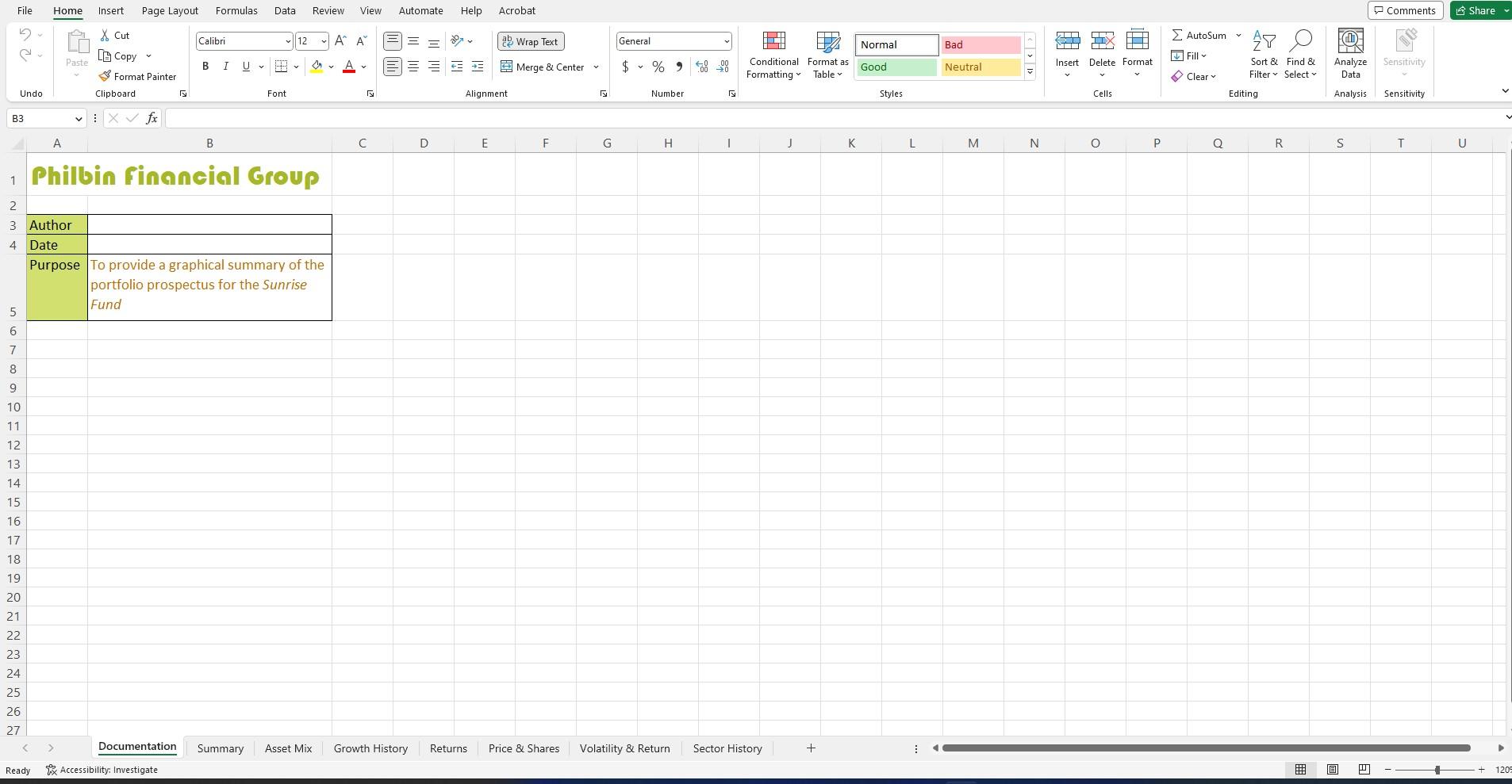
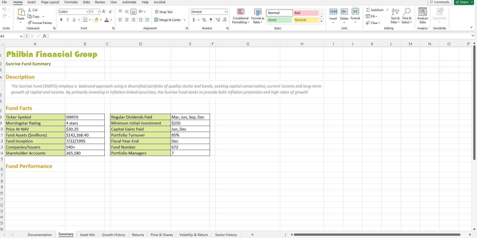
Data File needed for this Case Problem: NP_EX 4-3.xlsx Cerlus Car Rental lohn Tretow is an account manager for the Certus Car Rental, an industry-leading car rental firm that serves customers across the United States and overseas, John is developing a market report for an upcoming sales conference and needs your assistance in summarizes market infionmation into a collection of Excel charts and gnaphics. Complete the following. 1. Open the NP_EX_4.3.xlsx warkhook located in the Excel4 > Casel folder included with your Data Files Save the worktook as NP_EX_4_Certus in the location specified by your instructor. 2. In the Documentation sheet, enter your name and the date in the range B3:84. 3. John wants the report to include pie charts that break down the current year's revenue in terms of market (Airport vs. Off-Aiport), Car fype (Leisure vs. Commercial), and location (Americas vs. Internationall. In the Rentals by Type worksheet, do the following: a. Create a pie chart of the daa in the range A6:B7. Move the chart cover the range D5:F9 in the Analysis worksheet. b. Remove the chart title from the pie chart. c. Add data labels to the outside end of the two slices showing the percentage of the Aimort vs. O-Airport sales. 4. Repeat Step 3 for the data in the range A11:B12 of the Rentals by Type worksheet, placing the pie chart comparing Leisure and Commercial sales in the range H5:H9 of the Analysis worksheet. Excel | Module 4 Analyzing and Charting Financiat Data 5. Repeat Step 3 for the data in the range A16:B17 of the Rentals by Type worksheet, placing the pie chart comparing revenue between the Americas and lnternational sales in the range 15:19 of the Analysis workstieet. 6. John wants to present the company revenue broken down by car type. In the Car Models work sheet, create a clustered column chart of the data in the range A4:B9. Move the bar chart to the range B11:F21 of the Analysis worksheet. Remove the chart legend if it exists. Add data labels to the end of the data markers showing the revenue for each car model. 7. John also wants to track revenue for each car model over the years to determine whether certain car models have increased or decreased in popularity. In the Revenue by Year worksheed, create a line chart of the data in the range AA:F15. Move the chart to the range H11:521 in the Analysis worksheet. 8. Apply the following formats to the line chatt you created in 5 tep 7 : a. Remove the chart title. b. Add major gridlines for the primary vertical and horizontal axes. c. Move the chart legend to the right side of the chart area. d. Add axis tiles to the chart. Set the vertical axis title to the text Revenue (\$bil) and the hori. zontal axis title to Year. e. Set the interval between tick marks and between the labels on the category (horizontal) axis to 2 units 90 that the category labels are Y2011, Y2013, Y2015, Y2017, Y2019, and Y2021. 9. John wants to compare the Ctrtus brand to competing car tental companies. In the range F25:F29, insert line sparklines showing the trend in market share percentages using the data from the range B19;F29 on the Market Share worksheet. 10. Add green data bars with a gradient fill to the data values in the range E25:E29. 11. In the range F32:F36, insert line sparklines showing the trend in revenue using the data from the range B5:F15 on the Market Share worksheet. 12. Add orange data bars with a gradient bill io the data values in the range E32:E36. 13. John wants to present a more detailed chart of the revenue values from the five competing rental car agencies over the past several years. In the Market Share worksheet, create a Stacked Column chart from the data in the range A4:F15. Move the chart over the range H24:136 in the Analysis worksheet. 14. Apply the following formatting to the column chart you created in Step 13: a. Remove the chart title b. Add axis titles to the chart. Set the vertical axis title to the text Revenue (\$bil) and the horizontal axis title to Year. c. Move the legend to the right side of the chart area. d. Set the interval between tick marks and between the labels on the category (horizontal) axis to 2 units to display the calegory values Y2011, Y2013, Y2015, Y2017, Y2019, and Y2021. e. Set the gap width between the bars in the chatt to 30 w. 15. The company revenue decreased in the past year. John wants you to highlight this fact by adding a down-arrow shape from the Shape gallery to the right side of the merged cell B5 on the Analysis worksheet. Set the height of the down arrow to 1" and the width to 0.5 . 16. While the compamy revenue has decreased in the last year, is marker share has increased. Add an up-arrow shape to the right side of the merged cell B25. Set the arrow to be 1" high and 0.5 wide. 17. Save the workbook, and then close it. Philbin finnncial Group Sunrise Fund Summary Description The Sunrise Fund (SNRFD) employs a balanced approach using a diversified portfolio of quality stocks and bonds, seeking capital conservation, current income and long-term growth of capital and income. By primarily investing in inflation-linked securities, the Sunrise Fund seeks to provide both inflation protection and high rates of growth Fund Facts \begin{tabular}{|l|l|} \hline Regular Dividends Paid & Mar, Jun, Sep, Dec \\ \hline Minimum Initial Investment & $250 \\ \hline Capital Gains Paid & Jun, Dec \\ \hline Portfolio Turnover & 95% \\ \hline Fiscal Year-End & Dec \\ \hline Fund Number & 672 \\ \hline Portfolio Managers & 7 \\ \hline \end{tabular} Fund Performance Invectmpnt Sartarc Data File needed for this Case Problem: NP_EX 4-3.xlsx Cerlus Car Rental lohn Tretow is an account manager for the Certus Car Rental, an industry-leading car rental firm that serves customers across the United States and overseas, John is developing a market report for an upcoming sales conference and needs your assistance in summarizes market infionmation into a collection of Excel charts and gnaphics. Complete the following. 1. Open the NP_EX_4.3.xlsx warkhook located in the Excel4 > Casel folder included with your Data Files Save the worktook as NP_EX_4_Certus in the location specified by your instructor. 2. In the Documentation sheet, enter your name and the date in the range B3:84. 3. John wants the report to include pie charts that break down the current year's revenue in terms of market (Airport vs. Off-Aiport), Car fype (Leisure vs. Commercial), and location (Americas vs. Internationall. In the Rentals by Type worksheet, do the following: a. Create a pie chart of the daa in the range A6:B7. Move the chart cover the range D5:F9 in the Analysis worksheet. b. Remove the chart title from the pie chart. c. Add data labels to the outside end of the two slices showing the percentage of the Aimort vs. O-Airport sales. 4. Repeat Step 3 for the data in the range A11:B12 of the Rentals by Type worksheet, placing the pie chart comparing Leisure and Commercial sales in the range H5:H9 of the Analysis worksheet. Excel | Module 4 Analyzing and Charting Financiat Data 5. Repeat Step 3 for the data in the range A16:B17 of the Rentals by Type worksheet, placing the pie chart comparing revenue between the Americas and lnternational sales in the range 15:19 of the Analysis workstieet. 6. John wants to present the company revenue broken down by car type. In the Car Models work sheet, create a clustered column chart of the data in the range A4:B9. Move the bar chart to the range B11:F21 of the Analysis worksheet. Remove the chart legend if it exists. Add data labels to the end of the data markers showing the revenue for each car model. 7. John also wants to track revenue for each car model over the years to determine whether certain car models have increased or decreased in popularity. In the Revenue by Year worksheed, create a line chart of the data in the range AA:F15. Move the chart to the range H11:521 in the Analysis worksheet. 8. Apply the following formats to the line chatt you created in 5 tep 7 : a. Remove the chart title. b. Add major gridlines for the primary vertical and horizontal axes. c. Move the chart legend to the right side of the chart area. d. Add axis tiles to the chart. Set the vertical axis title to the text Revenue (\$bil) and the hori. zontal axis title to Year. e. Set the interval between tick marks and between the labels on the category (horizontal) axis to 2 units 90 that the category labels are Y2011, Y2013, Y2015, Y2017, Y2019, and Y2021. 9. John wants to compare the Ctrtus brand to competing car tental companies. In the range F25:F29, insert line sparklines showing the trend in market share percentages using the data from the range B19;F29 on the Market Share worksheet. 10. Add green data bars with a gradient fill to the data values in the range E25:E29. 11. In the range F32:F36, insert line sparklines showing the trend in revenue using the data from the range B5:F15 on the Market Share worksheet. 12. Add orange data bars with a gradient bill io the data values in the range E32:E36. 13. John wants to present a more detailed chart of the revenue values from the five competing rental car agencies over the past several years. In the Market Share worksheet, create a Stacked Column chart from the data in the range A4:F15. Move the chart over the range H24:136 in the Analysis worksheet. 14. Apply the following formatting to the column chart you created in Step 13: a. Remove the chart title b. Add axis titles to the chart. Set the vertical axis title to the text Revenue (\$bil) and the horizontal axis title to Year. c. Move the legend to the right side of the chart area. d. Set the interval between tick marks and between the labels on the category (horizontal) axis to 2 units to display the calegory values Y2011, Y2013, Y2015, Y2017, Y2019, and Y2021. e. Set the gap width between the bars in the chatt to 30 w. 15. The company revenue decreased in the past year. John wants you to highlight this fact by adding a down-arrow shape from the Shape gallery to the right side of the merged cell B5 on the Analysis worksheet. Set the height of the down arrow to 1" and the width to 0.5 . 16. While the compamy revenue has decreased in the last year, is marker share has increased. Add an up-arrow shape to the right side of the merged cell B25. Set the arrow to be 1" high and 0.5 wide. 17. Save the workbook, and then close it. Philbin finnncial Group Sunrise Fund Summary Description The Sunrise Fund (SNRFD) employs a balanced approach using a diversified portfolio of quality stocks and bonds, seeking capital conservation, current income and long-term growth of capital and income. By primarily investing in inflation-linked securities, the Sunrise Fund seeks to provide both inflation protection and high rates of growth Fund Facts \begin{tabular}{|l|l|} \hline Regular Dividends Paid & Mar, Jun, Sep, Dec \\ \hline Minimum Initial Investment & $250 \\ \hline Capital Gains Paid & Jun, Dec \\ \hline Portfolio Turnover & 95% \\ \hline Fiscal Year-End & Dec \\ \hline Fund Number & 672 \\ \hline Portfolio Managers & 7 \\ \hline \end{tabular} Fund Performance Invectmpnt Sartarc
Step by Step Solution
There are 3 Steps involved in it

Get step-by-step solutions from verified subject matter experts