

Question: Data Visualization (Chapter 8) Choose one type of chart from chapter 8 and use it to describe a real world situation. You can hand draw
Data Visualization (Chapter 8)
- Choose one type of chart from chapter 8 and use it to describe a real world situation. You can hand draw the chart or use a tool to generate one.
- NOTE: You must show an image . If you hand draw the chart, you can take a picture of it and show it .
Example below:
This chart shows the increase / decrease in the population of Bears, Dolphins and Whales for the years 2017 to 2022. The chart shows that Bears population is on a constant rise, whales population fluctuates and dolphins population is constantly declining.
use any type of this chart :
1. heat map
2.bar chart
3.histograms and probability distributions
4.line chart
5.area chart
6.scatter plot
7.bubble chart
8.pie chart
9.tree map
10.waterfall chart
11. sankey diagram
12. likert scale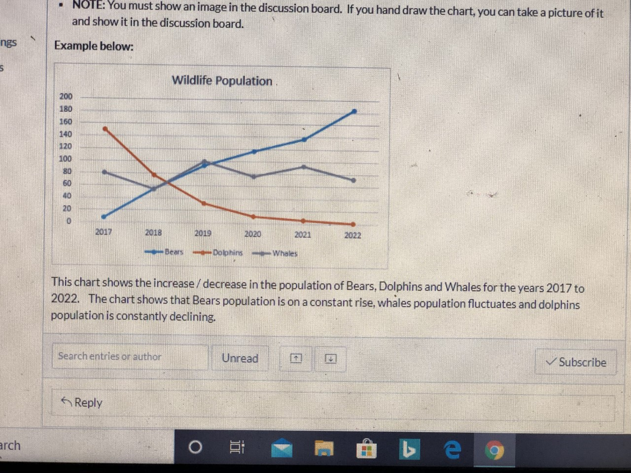
Step by Step Solution
There are 3 Steps involved in it
1 Expert Approved Answer
Step: 1 Unlock

Question Has Been Solved by an Expert!
Get step-by-step solutions from verified subject matter experts
Step: 2 Unlock
Step: 3 Unlock